Windows 11’s tabbed File Explorer is profoundly disappointing
Microsoft spent several years tinkering with a tabbed interface for the Windows File Explorer, but plans to add the feature to Windows 10 fizzled. It wasn’t until late 2022 that Explorer tabs finally arrived in Windows 11. You would think after years in development that the feature would be fleshed out and intuitive, but alas, Microsoft delivered only the most basic of functionality.
There are hints that Microsoft may add tabs to more built-in Windows apps, but it really ought to take another look at how people use tabs before doing that. Luckily, it needs to look no further than web browsers. Like, for example, the one Microsoft itself makes.
More tabs, more problems
For the entire history of Windows until late 2022, the File Explorer only showed one directory per window. Microsoft toyed with tabbed interface for Explorer in the Windows 10 era, but the feature was not fully realized until an after-the-fact patch for the big Windows 11 2022 Update. Now, you can click the “plus” button or hit Ctrl+T to open a new tab in File Explorer. While that part is the same as any modern web browser, that’s where the similarities end.
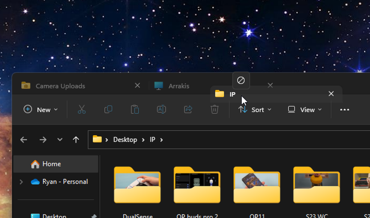
Bizarrely, Microsoft still treats tabbed Explorer windows as separate entities. If you open a new directory in Windows 11, it will open in a new window. Surely you can simply drag one tab over to the other to merge them, right? Nope. How about dragging tabs out of a Window to split them? Also no. Nor can you drag folders or shortcuts up to the bar to open them as a new tab. What about dragging tabs to rearrange them? You can! But the mechanics are awkward, forcing you to move the cursor all the way to the other side of a tab before Explorer keeps the new order. If you don’t experiment with this, you might not realize rearranging is supported at all.

Ryan Whitwam/IDG
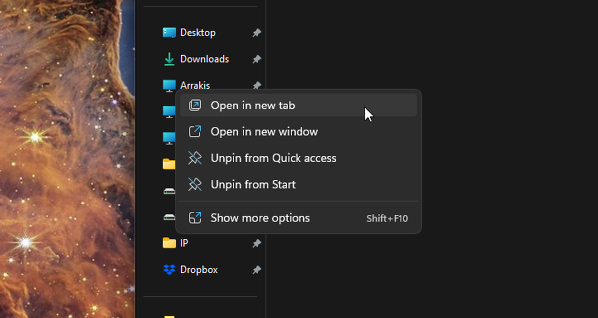
The only way to open a specific directory inside an existing window is to find it and right-click to access the context menu. There, you’ll find an option to open in a new tab. However, Microsoft has worked to optimize for touch in Windows 11—scarcely a single update goes by without Microsoft crowing about its more finger-friendly design. However, digging around in context menus is terrible for touchscreen usability. Dragging and gestures, which don’t work in the Windows File Explorer, are much better for touchscreen interactions.
Perhaps you’ve given up on dragging anything into the tab bar after a few frustrating interactions, but that’s what makes the way Windows 11 handles files in the tabbed explorer all the stranger. You can drag files and folders into the tab bar to copy or move them to another open directory, but it’s such a usability outlier as to be borderline undiscoverable.
This approach limits the effectiveness of the tabbed Explorer UI—it’s better than not having tabs, but it’s almost like the new Explorer was designed by someone who’s never used a computer before.
The browser standard
Instead of inventing a new and more clunky way of managing tabs in Windows 11’s File Explorer, Microsoft should have turned to the software that taught everyone how tabs should work: the web browser. Technically, a file explorer isn’t a web browser, so there’s no rule that says the tabs must operate the same way. However, if the goal is to create a good user experience, there’s really no alternative.
As the internet has become a larger part of daily life, we live more of our computing lives inside web browsers. Not only does the internet grant access to all the wealth of human knowledge, there are web apps that replace many of the dedicated programs we used to install on computers. Some of the most popular computers on Earth are Chromebooks, which are built entirely around an almost universal browser experience. Imagine if every time you clicked on a web link, it opened in a new browser window. You’d be understandably annoyed, but that’s the default behavior for the Windows 11 File Explorer.

How does Windows 11’s File Explorer not let you drag tabs to rearrange them?
Ryan Whitwam/IDG
Maybe the tabbed Explorer wouldn’t seem so strange if browsers didn’t exist, but they do, and now even novice computer users are familiar with how those tabbed interfaces work. This is the user experience touchstone that Microsoft should have used as a model. Instead, it rolled out the tabbed Explorer with all the aforementioned oddities. Maybe none of this should come as a surprise. Microsoft has stumbled with File Explorer redesigns more than once. Remember the ribbon UI?
It’s a mystery how Microsoft got all the way to release with the tabbed Explorer in such a state when the company also makes a web browser. Like all other modern browsers, the Chromium-based Edge has a tabbed interface that works in the standard way, letting you drag content and rearrange tabs effortlessly. Even before switching to the Chromium underpinnings, Microsoft’s custom Edge browser worked the same way. There’s just no reason for the File Explorer to ignore these established user experience principles. Before it adds tabs to more apps, Microsoft should decide if it really wants people to learn two different ways of managing them. Like it or not, browsers have set the standard, and it’s a waste to fight that.
For all the latest Technology News Click Here
For the latest news and updates, follow us on Google News.
