Understanding Microsoft Power BI’s default drilling
Being able to drill down through a summarized visual to details or specific facts is an expected feature in dashboarding. Power BI supports this functionality, but it isn’t automatic, so if you publish a summary visual without setting up drill through visuals, you might end up with frustrated end users. The good news is that while this functionality isn’t automatic, it is easy to set up.
SEE: Hiring kit: Microsoft Power BI developer (TechRepublic Premium)
In this tutorial, I’ll explain how to add drilling functionality to a summary visual in Microsoft Power BI. We’ll also discuss training end users on how to use the drill through feature because it doesn’t work with a double-click, as some might expect. Throughout this tutorial, I’ll be using Power BI Desktop on a Windows 10 64-bit system.
Here, you can download the Microsoft Power BI demo file for this tutorial and follow along.
Jump to:
Why you should consider drilling in Power BI
Drilling through related data is an established feature end users will likely expect. Drilling is a great way to examine details; the function can be used to explore specific facts, gaining insight the original visual doesn’t provide. For example, if an end user is viewing a monthly sales report, they might use drilling to see all orders for that month.
SEE: The Complete Microsoft Power BI Super Bundle (TechRepublic Academy)
Think of drilling as a way of looking for clues about specific data that is displayed in a visual or report. It’s a bit like holding a lens to the main visual to read the fine print. End users will most often use this feature when they want to see specific data rather than the aggregate.
Now, let’s examine a simple dataset to see how end users can benefit from drilling in Power BI.
How to prepare the summarizing visual for drilling
Let’s suppose you’re basing visuals on the sample dataset shown in Figure A.
Figure A
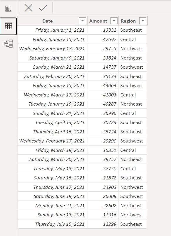
Specifically, you want to display a monthly sales report (Figure B). In this scenario, end users might want to see the actual sales for a specific month, but when they double-click on a month entry, they get no additional information. They may then look around but find nothing that shows them the sales information they want for each month.
Figure B
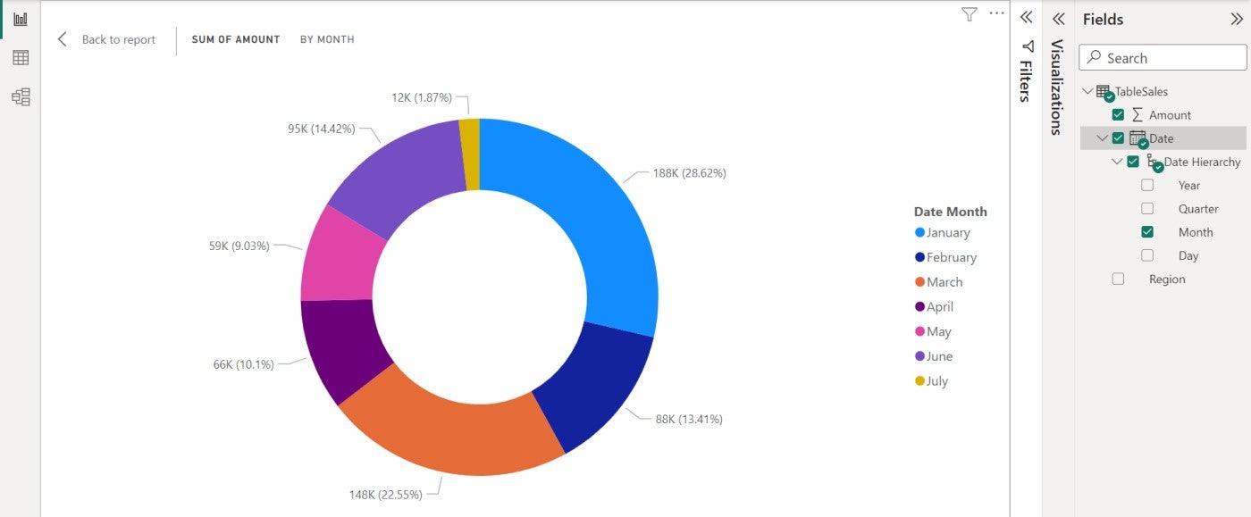
To set up drilling, you need a summary visual and any number of visuals that display the facts or data evaluated in those summaries. We’ll use a donut visual to display a monthly summary of sales based on the dataset shown earlier in Figure A. In the next section, we’ll build the drill through visuals.
To get started, you should base a donut visual on the Amount and Date fields in the TableSales table. Using the Visualizations pane, drag Date to the Legend bucket. Power BI will add a Month field, which it will use to summarize the data. You can specify a different date component by expanding Date Hierarchy.
Next, drag the Amount field to the Values bucket. Power BI renames it to Sum of Amount because Amount is a math column; Power BI assumes you will run calculations on this field. You can rename the field in the visual if you would like to.
Where does the Data Hierarchy come from in Power BI?
If you’re wondering where the Date Hierarchy came from, Power BI creates it when you import Time and Date values by automatically adding each date’s month, day of the week, year and so on. This is one of the things Power BI does internally, saving you a lot of work. Power BI uses the Auto date table, which you can’t see, but it’s used to create Date Hierarchy.
To learn more about hierarchies in Power BI, you can read How to build a hierarchy to support drill mode in Microsoft Power BI. To learn more about date tables, you can read How to know if the Auto date table is adequate when using Power BI and How to create a date table in Microsoft Power BI.
Now, let’s add a drill through visual Power BI can display when an end user wants to see all of the sales records for the month we’ve selected in the donut visual.
How to add a drill through visual in Power BI
End users might want to see the details evaluated each month’s summary values shown in the donut visual. Right now, there’s no drilling in the visual. We’ll need to add drill through visuals — the visuals that will display details about monthly sales.
To get started, add a new page; drill through works with pages only. You can change the page name if you like, but it isn’t necessary. Then, add the visual you want to display the detailed records for each month.
Remember, the summary visual — the donut visual — displays monthly totals. We want a visual that displays all of the sales records for the currently selected month in the donut visual. For instance, if you select May, you want to see the sales records for May.
On page two, add a table visual based on all three fields. We don’t need Region because there’s no drilling on Region, but end users might want to see it.
Now, let’s add Amount as the drill through field. Right-click the Amount field in the Fields pane, and choose Add To Drill Through from the resulting dropdown (Figure C).
Figure C
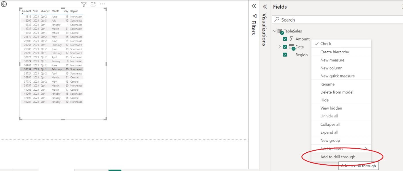
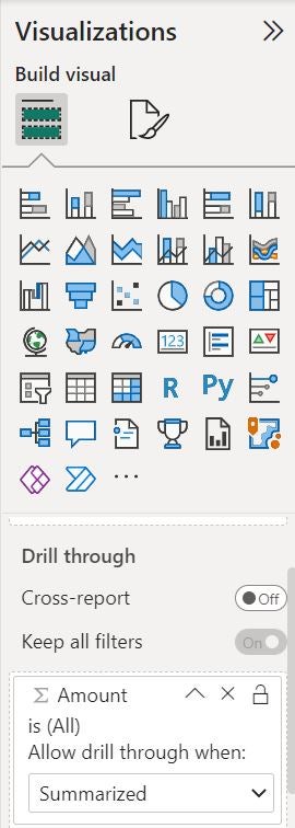
If you check the Visualizations pane, you’ll see that Power BI added the Amount field to the Drill Through bucket, as shown in Figure D.
Figure D
How to use drill through in Power BI
Everything is in place now, and the drill through functionality is ready to use. To use it, return to the donut visual on page one and right-click May. Then, choose Drill Through and Sales Details, which is on page two if you didn’t rename the page when you added it (Figure E). In response, Power BI shows the table visual filtered to display only the records for May, the selected month in the donut visual.
Figure E
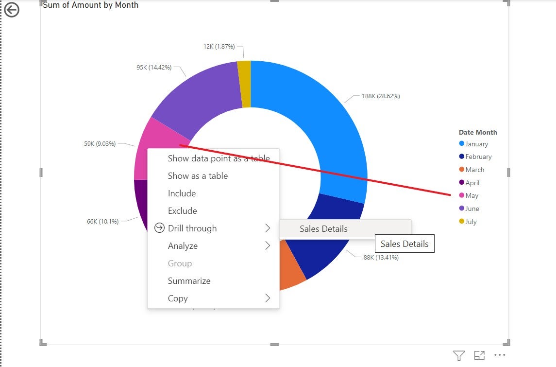
Figure F shows the drill through table, filtered to display only two records because there are only two sales records for May. Power BI filters the records by the month selected in the donut visual.
Figure F
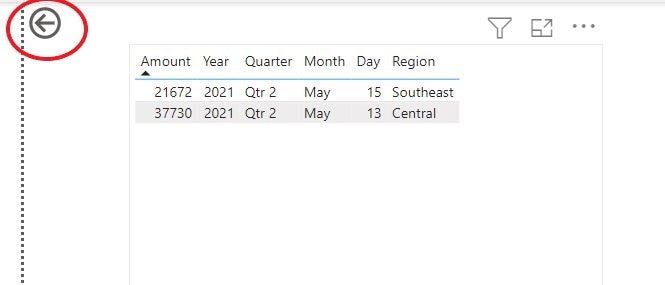
To return to the donut visual, hold down the Ctrl key and click the back arrow in the top-right corner. Regardless of the number of pages between the donut and the table visual, this arrow will always take you back to the donut visual. It’s part of the drill through feature that Power BI added when you added the drill through field.
There are a few additional things you’ll want to know about this process:
- If you click the page two tab, the visual won’t update. You must use the right-click drill through route.
- As is, you can drill one month at a time.
- Drill through fields must be in the original summarized visual — the donut visual, in our case. This limitation makes sense but does require a bit of planning, so the drill through visuals can show the details your end users want to see.
- You can always add more drill through visuals. Just remember that each requires its own page.
If you’re working with end users who aren’t familiar with Power BI, you should take the time to show them how to use the drill through functionality. Otherwise, they might miss the feature altogether.
SEE: Quick glossary: Business intelligence and analytics (TechRepublic Premium)
You might be wondering why you’d force end users to right-click and choose a drill through visual when you can use a filter on the same page. Most reports have a lot of visuals, but drill through allows you to group several high-end visuals on the main page while still allowing end consumers to see details. It’s another way to arrange data that can make data visualization easier, depending on the dataset and use cases you’re working with.
For all the latest Technology News Click Here
For the latest news and updates, follow us on Google News.
