

Hand-drawn ‘Storefronts & Signages’
| Photo Credit: Bombay Duck Design
When directing someone to a location, chances are you’ll probably guide them with signages, eschewing formal road names. “Turn left after the Mother Dairy hoarding; take a U-turn when you see the SBI ATM; the office is bang opposite the Croma showroom!”
Brands, and their signs and logos, are omnipresent in our lives and make up a large part of our visual and cognitive language without us realising it — sparking everything from assurance and nostalgia to confusion at the garble of jargon. “Graphic design in India is overloaded with all kinds of forms, sizes and colours, and it can be overwhelming to our senses. One tends to call it a ‘mess’ or ‘chaotic’. This show points the viewer in a direction to change their perspective and biases, and understand why it all seems so overwhelming,” explains artist and designer Sameer Kulavoor, who co-founded Bombay Duck Designs, an independent design studio in Mumbai, with designer Zeenat Kulavoor. Together, they’ve put together an illustrated documentation of Indian printed and painted graphic design samples and signages across the decades in an exhibition titled Everyday India at 47-A, in Khotachiwadi.

Artist and designer Sameer Kulavoor
| Photo Credit:
Bombay Duck Design
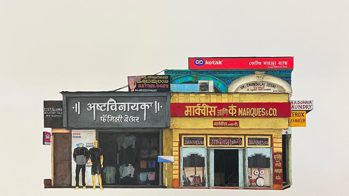
Deep-dive into India’s visual culture
Divided into four parts — ‘Storefronts & Signages’, ‘Illustrated Specimens’, ‘Brand Guides’ and ‘OH FLIP!’, a series of five flip books — the show opens with six hand-drawn artworks that illustrate fictional shop fronts boasting a crammed cluster of signages haphazardly placed together to create layers of cultures and languages. “In a sense, India is a collage of many distinct parts and we wanted to bring that idea to the fore,” says Sameer. These are paired against a series of five digital collage art prints that look at informal rules that influence the design for a particular product or service.

Everyday India at 47-A, in Khotachiwadi
| Photo Credit:
Bombay Duck Design

Everyday India
| Photo Credit:
Bombay Duck Design
“An Indian photocopy shop has a peculiar black-and-yellow branding with a prominent use of bold and repetitive typography. If a signage was in a blue-and-white colour scheme, one wouldn’t trust the shop,” explains Zeenat. “Similarly, surma’s packaging would be unrecognisable without the motif of an eye. These brand categories and their unique visual languages are deeply embedded into the psyche of the common man and woman.”

‘Brand Guides’
| Photo Credit:
Bombay Duck Design

‘Illustrated Specimens’
The intricacy of the show is highlighted across 320 illustrated specimens of branding and packaging, ranging from bus tickets and Parle-G biscuit wrappers to album covers, tetra packs and tin boxes. “The specimens we picked were designed by all kinds of designers from rural and urban areas, formal as well as informal. The point was to make sure that this is a true representation of the plurality and multiculturalism of our country and doesn’t become just another exercise in kitschy and exotic Indian vernacular graphic design,” adds Zeenat. Ideated and conceptualised in November 2022, the show went through three iterations, followed by three months of intensive research, illustration and design to put together this body of work.

Designer Zeenat Kulavoor
| Photo Credit:
Bombay Duck Design
It’s hard not to stop and stare at each design, recalling a fond memory when seeing an old copy of Chacha Chaudhary comics or a pack of Phantom Sweet Cigarettes or laughing out loud at the functional idiosyncrasies of a product’s usage, such as the iconic blue Camel Paste bottle with its hard-to-use brush.
Flip to find out more
The flip books playfully document the ubiquitous iconography found in our urban lives, such as the ominous skull harking a danger sign. The flipbook format gives the viewer a sense of being in motion — through a cab window or on a bike, or even while brisk walking or running — while looking at these signs because, as Zeenat describes, “In urban India one is always on the move and these signs have to do their job in a very brief moment of time.”

The ‘OH FLIP!’ series

Everyday India at 47-A
| Photo Credit:
Bombay Duck Design
The gamut of the show’s documentation comes together in an eponymously titled book with contributions in the form of essays by writers Khorshed Deboo and Anusha Narayanan, designer Kay Khoo and theorist Kaiwan Mehta. “India continues to be a melting pot of designs, where the global exists next to the absolute local,” says designer-curator Srila Chatterjee, with Sameer adding, “The multiplicity of Indian society is manifested in our graphic design. With aggressive nationalism, majoritarianism and imposition of ‘single identity’, there may be a risk of losing our diversity, and that will reflect in everything culturally, including design.”
Everyday India is on till August 27 at 47-A.
The writer and creative consultant is based in Mumbai.
For all the latest Entertainment News Click Here
For the latest news and updates, follow us on Google News.
Denial of responsibility! NewsBit.us is an automatic aggregator around the global media. All the content are available free on Internet. We have just arranged it in one platform for educational purpose only. In each content, the hyperlink to the primary source is specified. All trademarks belong to their rightful owners, all materials to their authors. If you are the owner of the content and do not want us to publish your materials on our website, please contact us by email – [email protected]. The content will be deleted within 24 hours.