I just tried all of Gmail’s new features — here’s the best and worst
Google just gave Gmail a big shakeup that changes the layout and brings many new features to your inbox. The change is probably one of the biggest by Gmail in the last 18 years. If you have chosen not to revert back to the original design, it is likely that you are looking at the new Gmail interface while browsing through your emails.
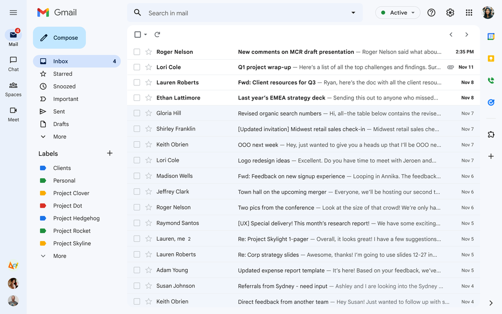
The most prominent changes include new color themes, an updated search feature, refreshed menu and navigation tools and a new way of interacting with Google Meet, Chat and other apps within the Gmail interface.
In a blog (opens in new tab), Neena Kamath, Product Manager of Gmail, says the redesign is a push towards a “unified Gmail” so it is easier to shift and navigate between Google’s many apps.
Google has been trickling in many of these changes recently and while some of the changes lie under the hood and have become hard to keep track of, I tried all the new features the tech giant brought to Gmail recently.
As an avid user of Gmail and Google’s suite of apps — both for personal use and for work, I switched to the new Gmail interface as soon as it rolled out. Some of the changes seem integral and are a definite improvement while others were just plain annoying. Here are the ones worth trying and will boost your productivity.

Gmail: new features I like
New layout
Gmail’s new redesign does take some getting used to. Much like its logo, the edges are much softer and Google is trying to let you shift between apps seamlessly (something they have struggled with in the past).
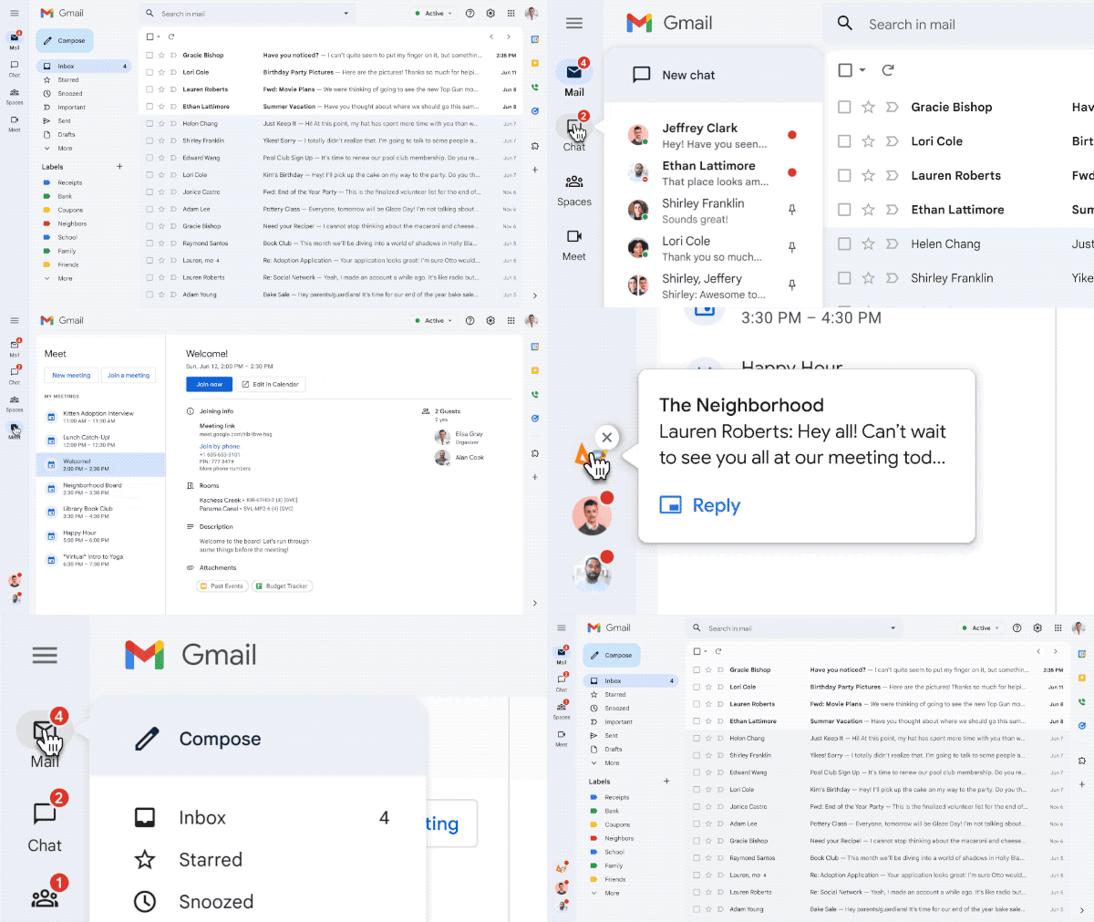
Gmail’s new UI pushes Mail, Meet, Spaces, and Chat buttons to a left panel. You can switch within the apps and will not be bothered by Chat bubbles popping up. This is something I kind of preferred earlier because now my notifications are slightly lost, but overall it might be a good move to keep distractions at bay. There’s an option to “Quick reply” to Chat messages as well now.
You can also hover over the app icon on the left panel which will show up a quick list of chats or emails.

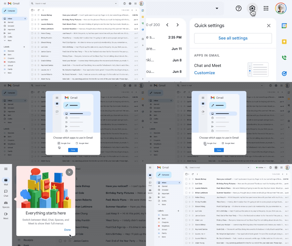
The best part of the redesign is that you can customize everything. So using “Quick Settings” I could just have Gmail, or on some days where I had a lot more meetings, I could put up Gmail and Meet on my tabs. The labels (like Starred, Snoozed, Important) can be customized, too — which is so convenient because Google’s default labels are slightly confusing just for me, let alone their AI.
You can also check out our quick guide on how to customize the side panels on your Gmail.

There is a clean, new look that Google’s Material Design 3 (opens in new tab) brings. It looks pretty slick, even in dark mode. The classic red and white have given way to softer blues on the interface. The colors are much more pleasing in the redesign.
I have set different profile colors for my Google Workspace for my personal and work account. This lets me easily identify which one I am on and I like that Google has made it easy to switch between profiles in the right corner.
Better search options
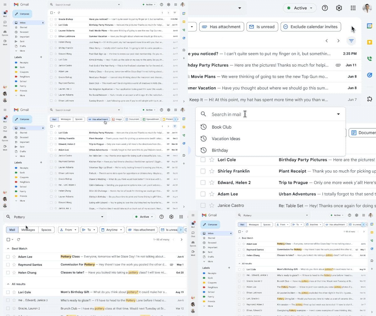
Google’s search chips are now on Gmail, which means there are several different filters to choose from to get to the mail you are searching for.
This accompanies an improved machine learning search that Google has recently rolled out for Gmail. In a blog post (opens in new tab), Google says Gmail has “more accurate and circumstantial search suggestions with better customization as a result of our new machine learning models”.
Search suggestions were earlier sorted according to a sender’s last name — now, Google will match the name and contact email more seamlessly and claim “suggestions are reordered to more likely match contact queries with first names or email addresses”. This should come in handy if you’re used to searching for contacts with their first name, as these results will now appear at the top.

I tried the new search with some complicated details, and when I searched for the first name of the person it brought up their email in a more contextual and chronological order than what Gmail did before. There are also personalized suggestions for contacts now within Gmail and chances are Google knows who’s your manager or which colleague you interact with the most. My auto suggestions definitely made me think so, and the search is a lot more intuitive now.
Gmail will almost ensure you’re emailing the right person, and the AI based improvements are similar to Gmail’s Smart Compose or Smart Reply features that the Google came up with a few years ago. (On that note, you can also learn how to disable Gmail’s smart features to prevent tracking).
Gmail: new features I don’t like
There is a lot more to like than not like with Gmail now. But not everything is as dewy as the fresh look of Gmail’s interface. Google’s effort to get all its apps together seems to be a long standing goal — one that might still take some time to get right. The push makes Gmail look a lot more like Microsoft’s Outlook, and while that may not be a bad thing — I do wish we had more flexibility in apps that can be propped up within Gmail.
As of now, Gmail’s mini apps — Meet or Chat can be added or removed in the interface. Google could have expanded this to some of its other Workspace apps like Calendar to make it more easy to access. Some of Google’s apps are slightly similar and they also tend to overlap with each other. I feel Chat could do most of the functions Spaces has, without the need for an extra tab.
Plus, Google has made a full list of conversations from Spaces, Meet or Chat open out on full a single screen. I wish Gmail would take a page out of iPadOS 16 and have more multitasking features or even split screen views of the apps.
Search within Gmail used to be a lot less effective — so I am glad that Google has focussed on vastly improving that.
Gmail for tablets
Most of the new Gmail changes are directed at improving the web experience for Gmail. But Google has said that it will roll out an improved experience for tablet users that includes better emojis and new accessibility features.
Gmail also introduced new tablet-focused features for Drive, Keep, Docs, Slide and Sheets in July. The updates are very handy and include drag-and-drop for images and files across apps, along with a multi window experience for Drive. We hope these make their way to Gmail soon as well.
Navigating the new Gmail redesign can be slightly daunting. If you’re not a fan, Google explains how to roll back to the old look (opens in new tab).
For all the latest Technology News Click Here
For the latest news and updates, follow us on Google News.
