Angel City FC reveals crest celebrating the team’s values, Southern California roots
As a fledgling franchise entering Southern California’s crowded sports marketplace, Angel City faced a challenge when it set out to design a crest that both fit in with the region’s 12 other professional teams yet also represented its own unique culture and ambitions.
“We’re doing something really special here,” said Kayla Green, head of marketing for the women’s soccer team, which will enter the NWSL in spring 2022. “The launch of this team is a true call to action to galvanize our community, fans, players around the world to collectively seek to raise the expectations of this game on and off the field.”
Makes sense as a mission statement. But just try getting all that into the tiny logo that will go on the jerseys, the next logical step in the club’s branding.
Since Angel City’s investors, the largest female-led ownership group in North American professional sports, announced they were forming an NWSL expansion franchise 11 months ago, they have methodically gone about building their team, hiring a sporting director, a vice president of player development and a scouting director. The team has signed sponsors for both sides of its jersey and the sleeve, and will play at Banc of California Stadium.
On Wednesday morning, it added another piece to that puzzle when it unveiled its crest and colors, giving the club a look to go with its socially conscious, barrier-breaking culture.
“Our visual identity,” Green said, “absolutely represents this.”
Angel City took the first steps toward finding its look late last year when it settled on the team’s three official colors. Armour, a light gray, represents preparation and dedication. Sol Rosa, a pink pastel, suggests the Southern California sun and horizon. Asphalt, a dense and dark hue, is the diverse Southern California community and the streets everyone walks daily.
The club then asked eight artists to take those colors and the team’s values and bring them to life.
Amedea Tassinari, a self-described Southern California sports fan who grew up in the shadows of the San Gabriel mountains, was in Yosemite when she got the call from Angel City asking her to sketch out her ideas.
“I was just sitting on some rocks next to a waterfall and there were hawks flying over me. It reminded me of home,” said Tassinari, 27. “A lot of it was things I think about Los Angeles. The feeling I have as an L.A. sports fan, as a a female athlete, employee etc.

(Courtesy of Angel City FC )
“But at the same time I did my due diligence and research. I gathered my inspiration and then kind of looked into each piece. What does this mean and how does it relate to the team?”
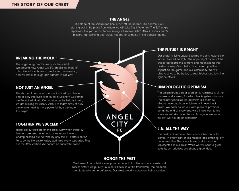
The crest she came up with features an angel with a pair of wings that have a dozen feathers combined, 11 of which represents the team’s starters while the 12th stands for the supporters, the investors and everyone else that helps the team fly. The angel is ascending toward the sun, a statement of optimism but also a nod toward Angel City’s desire to have a positive impact on the game and the community.
The team name is at the bottom of the crest, which has a traditional shape intended “to honor the past, honor soccer and all of its roots,” Tassinari said. The line across the top of the crest, meanwhile, is nontraditional, running from left to right at a 22-degree angle, with the angel’s wing protruding at the top left corner. The number 22 is inspired by both the team’s inaugural season, 2022, and the 22 players on the pitch, while the wing’s protrusion represents the team breaking the mold of expectation.
“Every bit of it has to mean something,” said Jennifer Pransky, Angel City’s head of content. “We needed it to be unique. We’re trying to push boundaries and stand out in not just a very busy sports landscape here in Los Angeles but in one that has plenty of amazing teams just within the league.
“Any time anybody says ‘that’s the way it’s always been done,’ to us that feels more like a challenge.”
Angel City is hoping the crest will soon be ubiquitous, gracing not only the team’s uniforms but appearing on its website, on mobile devices, team merchandise, billboards in English and Spanish — even wrapped on Metro trains.
“Thinking about where this crest lives is super important,” Tassinari said. “How we use it is definitely really intentional, whether that’s a jersey or ads and things like that.”
“The nature of this opportunity is not lost on me that’s for sure,” she continued. “For me it was mainly like ‘what can I do for my fellow Angelenos?’ Being the first to design things for this team is going to determine how people view this team. But for me it’s also ‘I have to get this right for my people.’ I’m an Angeleno and a sports fan and how do I represent everything?
“It was just so important to me to get it right.”
Because even soccer teams don’t get a second chance to make a first impression.
window.fbAsyncInit = function() { FB.init({
appId : '134435029966155',
xfbml : true, version : 'v2.9' }); };
(function(d, s, id){ var js, fjs = d.getElementsByTagName(s)[0]; if (d.getElementById(id)) {return;} js = d.createElement(s); js.id = id; js.src = "https://connect.facebook.net/en_US/sdk.js"; fjs.parentNode.insertBefore(js, fjs); }(document, 'script', 'facebook-jssdk'));
For all the latest Sports News Click Here
For the latest news and updates, follow us on Google News.
