Vivaldi 6.0’s custom browser icons let you party like it’s Windows 95
If you’re in the mood to fill your browser with dumb references to The Office, Star Wars, One Piece or the devil’s lettuce on 4/20 — and get something more useful out of it — the newly announced Vivaldi 6.0 may have what you’re looking for.
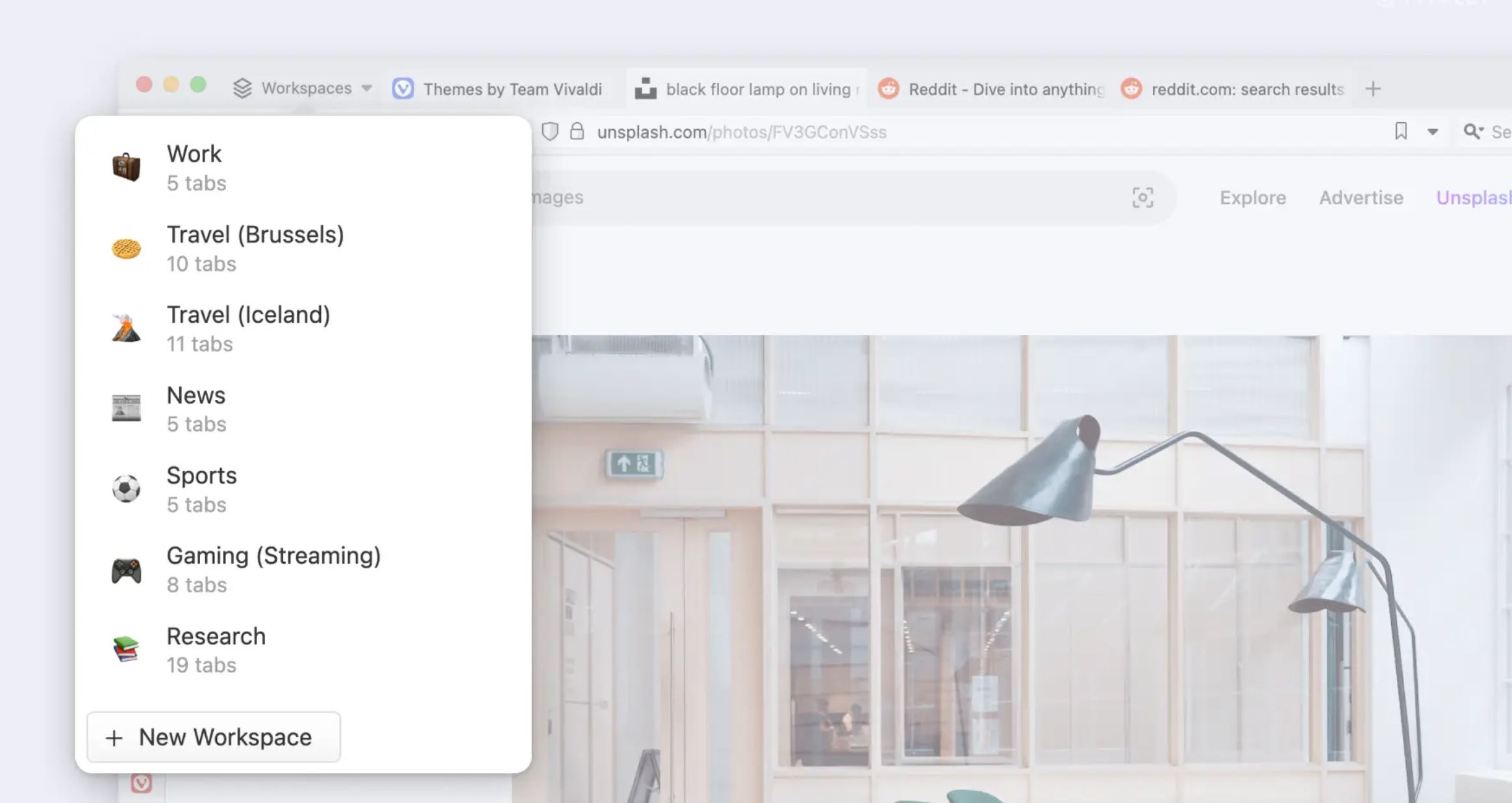
Add another reason to switch from Chrome to Vivaldi: the ability to add custom icons and backgrounds to the browser, either ones you make or that others have put together. Vivaldi also debuted Workspaces, just another way to organize tabs into various groups to help you organize your life.
Designing custom icons and backgrounds isn’t all that new. The earliest versions of Windows offered different takes on cursors, icons, and so on. But Vivaldi 6.0 allows you to personalize your browser in much the same way you’d personalize your PC: by adding your own takes on icons like the home icon, and the “forward” and “back” arrows. It’s the kind of dumb stuff that you and only you would care about, but it’s your browser, you know? Think of it like a sticker for your laptop.
Unfortunately, Vivaldi collects a number of themes within its browser, but generally leaves the personalized icons for you to add by downloading images and so on. (It’s probably not worth the risk of attracting the wrath of Disney’s lawyers, for example.) Vivaldi does collect some of the less problematic themes for you to enjoy, though, such as a Windows 95 theme (above) for a retro feel. (While that theme is live, you’ll need Vivaldi 6.0 to include the icons.)


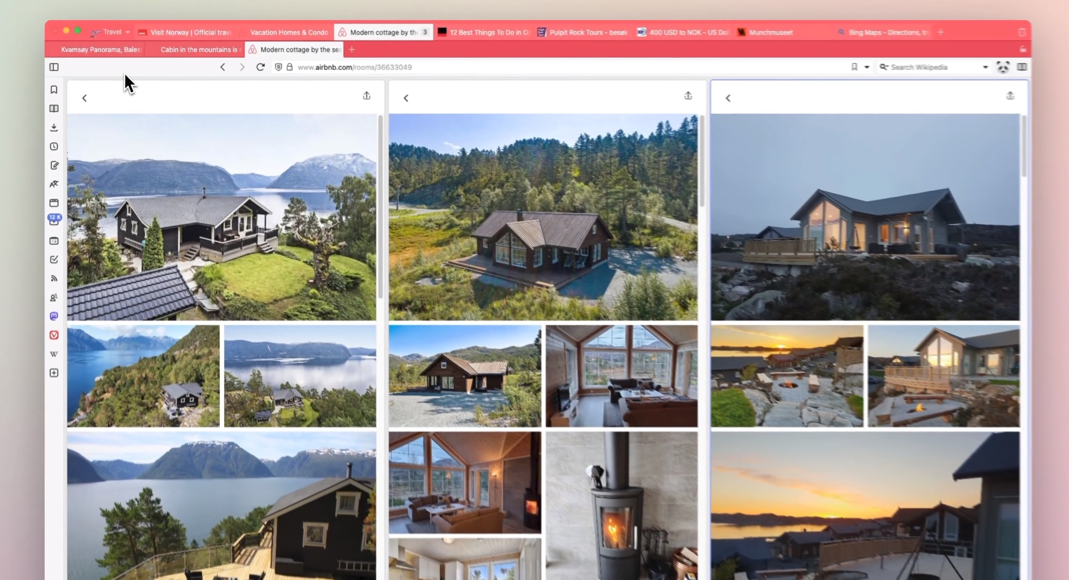
The new Workspaces feature is a bit more prosaic. Vivaldi has offered the ability to add a second row of tabs for a while now, and Workspaces is basically like a bookmarked row of themed tabs that you can collect in either the primary or secondary row. (In this way, it’s a bit like the Collections feature in Microsoft Edge.) All you need to do is select a new Workspace, then add tabs to it and save them in a group. You can then open them all up — including stacking them, another feature Vivaldi has offered. (Vivaldi’s macros and “accordion tabs” are even more.)
Of course, it’s up to you how you take advantage of the new tabs and what themes you apply to them. The only feature that Vivaldi is leaving out is probably applying custom themes to custom Collections. Maybe we’ll have to wait for Vivaldi 7.0 for that!
For all the latest Technology News Click Here
For the latest news and updates, follow us on Google News.
