
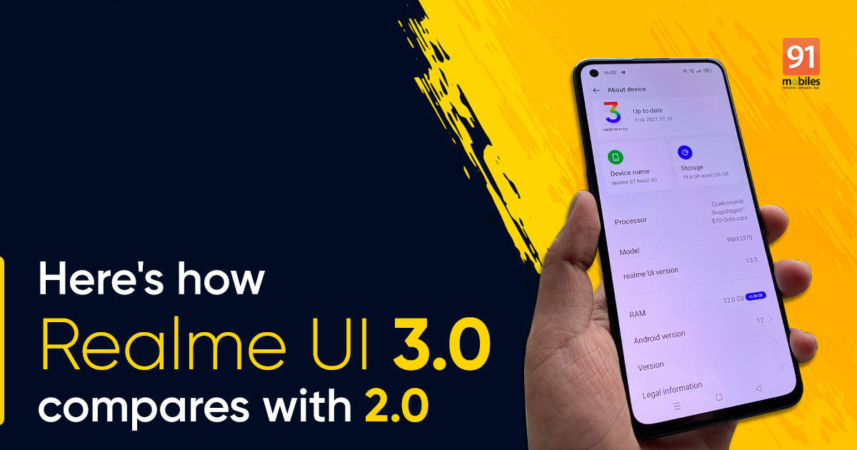
Realme UI 3.0, which is based on Android 12, has started to roll out on several of the company’s high-end devices. I had done a quick review of the UI back in October when it was still in beta. However, now that the stable version has arrived, it might be prudent to see how it compares to its previous iteration, Realme UI 2.0.

I downloaded the new software update on the Realme GT Neo 2 5G (review) while the Realme X7 Max (review) is running on the older 2.0. In this detailed comparison let’s find out all the major differences and upgrades between the two versions.
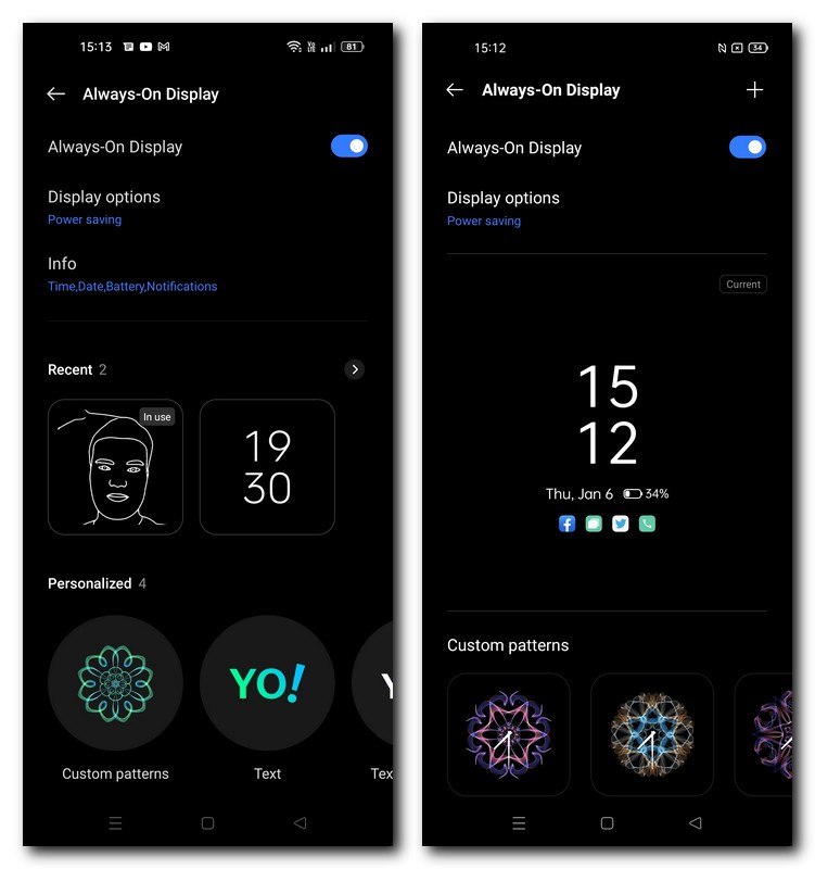
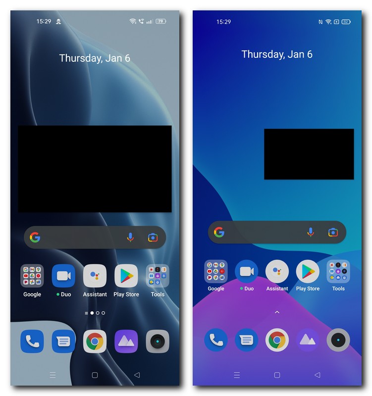
New Settings menu and Always-on-display
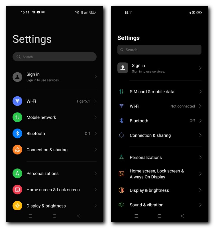
The new 3.0 version has implemented a more colourful and thematic version of the stripped-down settings menu seen on Realme UI 2.0. The icons are more defined and visually more attractive, which is in line with the youthful appeal of Realme devices. Even the AOD (always on display) follows up on this theme with a new facial sketch that outlines a portrait of your face and sets it up instead of the usual, repetitive pattern and clock variations.
The UI elements inside the settings menu are arranged in a manner that prominently highlights the new UI’s vibrant nature. An example of this is the About Phone tab which has a much more exuberant look on Realme UI 3.0 as compared to its previous iteration.
Edge lighting and colour themes
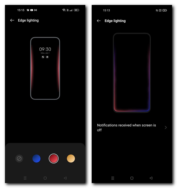
Apart from that, the fingerprint sensor animations can also be customised while the edge lighting for notifications now has different colour profiles that can be used. Realme UI 3.0 also offers the option to set a theme across the UI which matches the colour of your current wallpaper on the home screen.
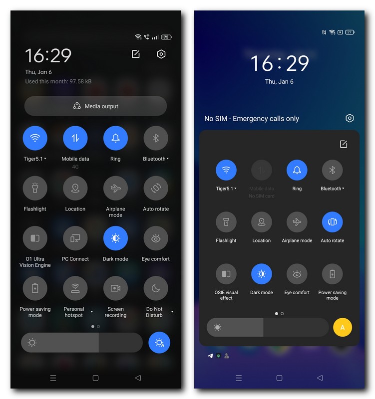
Floating Window 2.0 and improved Quick settings
Putting aside the overarching colourful theme on 3.0, Realme has also emphasised on the animations while browsing and a new outlook for apps that support picture-in-picture mode. The floating window’s size can now be adjusted with a simple pinch of your fingers while the animations to bring an app in PiP have also been refined. This is especially noticeable when opening new apps or closing the floating window, both of which are devoid of the slightly jerky movement that is prevalent on Realme UI 2.0.
The drop-down Quick settings panel is extended all across the display as opposed to occupying only the screen’s centre in the earlier version. This adds a fourth row of icons and also a tab called Media output which shows the media devices connected to your smartphone.
Smooth Animation Engine and improved privacy
The Smooth Animation engine claims to offer up to 30 percent faster app launching speeds while using less battery to do it in comparison to what Realme UI 2.0 can offer. While comparing the two devices, both of which have 120Hz refresh rate screens, the difference was noticeable but to a very slight degree.
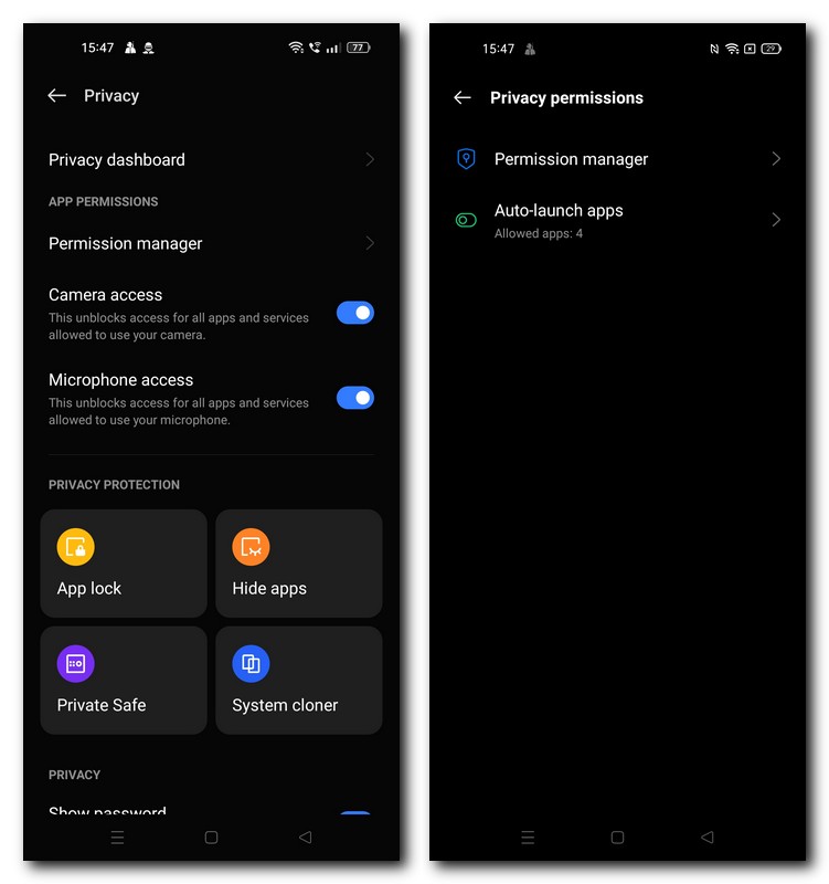
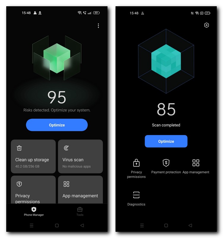
The Realme Phone Manager, responsible for clearing junk files, optimising battery, privacy during transactions, app management and more is also getting an overhaul in Realme UI 3.0. Realme has made some real strides in the privacy department on its device and offers a stronger control over privacy permissions.
Battery management and Games
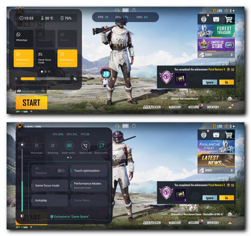
Battery settings also get new UI elements that shows in real-time, via a graphical representation, how much battery is being used by the phone instead of just displaying a percentage icon. For gaming-related usage, the previously used Game Space has been rebranded as Games.
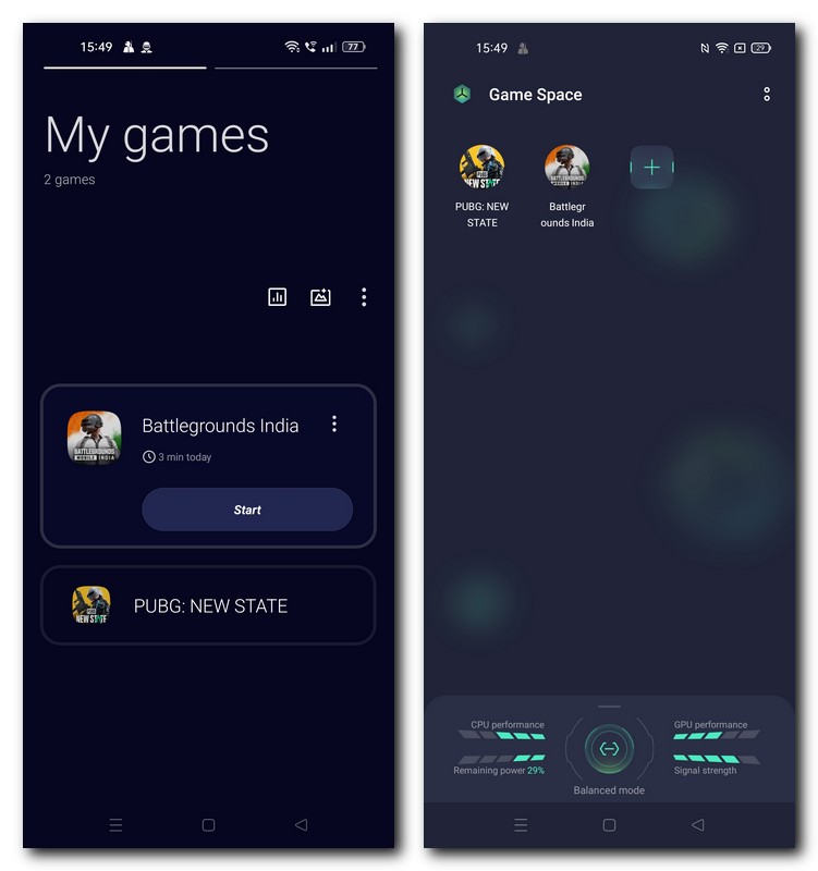
Everything from the interface to the arrangement of games to the power optimisations looks quite similar to OnePlus’ OxygenOS. The Game Assistant, which is Realme’s software hand inside the game, has also been overhauled and simplified for the user’s convenience. An example of this is how you can permanently pin the CPU and GPU usage along with the fps count inside a translucent tab and place it on the display’s top.
So that was a look at the key differences between the two versions of Realme UI and the new features offered by the latest update.
For all the latest Technology News Click Here
For the latest news and updates, follow us on Google News.
Denial of responsibility! NewsBit.us is an automatic aggregator around the global media. All the content are available free on Internet. We have just arranged it in one platform for educational purpose only. In each content, the hyperlink to the primary source is specified. All trademarks belong to their rightful owners, all materials to their authors. If you are the owner of the content and do not want us to publish your materials on our website, please contact us by email – [email protected]. The content will be deleted within 24 hours.