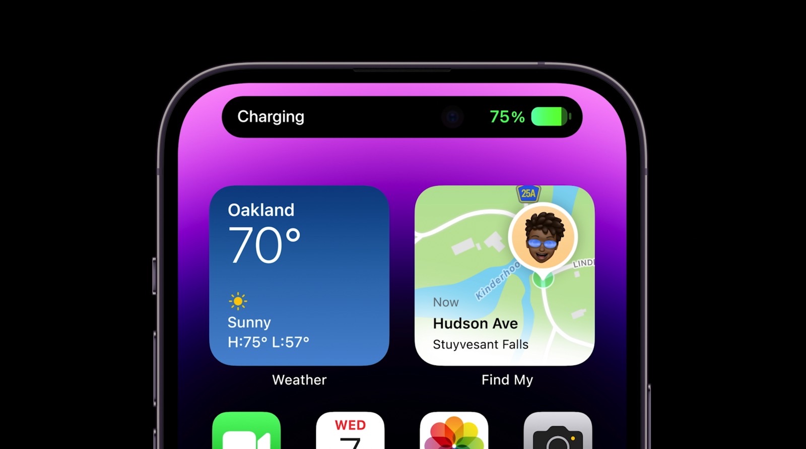
I was wrong about the iPhone 14 Pro’s Dynamic Island – here’s why
The iPhone 14 Pro’s Dynamic Island was probably the biggest surprise from the iPhone 14 launch event in early September. We knew the iPhone 14 would have a new pill-shaped notch heading into the event. But we had no idea how Apple would “weaponize” it with software.
The pill notch is a necessary design compromise. But the Dynamic Island turned it into the most talked-about new iPhone 14 feature. It’s a feature that Android app developers have already started to copy.
Still, I said at the time that I’d rather turn off the screen distractions on my iPhone 14 Pro. I can do without the interactions that appear in the Dynamic Island. Two months later, I realized how much I actually like it, to the point of taking it for granted.
The Dynamic Island displays content from up to two apps with ongoing background activity. Many of Apple’s iPhone apps support the Dynamic Island. More third-party apps will do so as well as developers adapt to the new technology.
On top of that, there’s the support for Live Activities that arrived in the iOS 16.1 update. This should further convince developers to customize their apps to show content on the iPhone 14 Pro’s Dynamic Island when appropriate.

I said before that I hardly interact with the Dynamic Island, but I’ve come to appreciate those interactions. The information it presents doesn’t always require interaction either. Whether you like the animations or not, you get used to seeing the Dynamic Island extend and contract.
Over time, I’ve come to appreciate it and take it for granted for a reason I hadn’t stopped to consider before: Multitasking. The apps that appear in the iPhone 14 Pro’s software notch are often apps that require your attention.
For example, you might want to check on the Uber you just booked without going into the iPhone’s multitasking menu. I can repeat the process as many times as I need for updates and then go back to what I was doing on the iPhone.
The same goes for tapping on a new song’s album to find out what song it actually is. No more hunting for the music app in the long list of open apps.

They might seem inconsequential, but these rare interactions with the Dynamic Island are simply great. The whole thing just works. The Dynamic Island saves you time, and you can focus on whatever app or activity you’re engaged in.
Sure, it’s only a few seconds that you save here and there, but it’s still a neat feature that appeals to human nature. Ideally, we want everything to be done quickly and easily. We’re also lazy and ready to utilize whatever shortcuts are available.
That’s why I was wrong about the Dynamic Island when I thought I’d want to turn it off. It’s now an iPhone 14 Pro feature I take for granted, one that I’d certainly miss if I were to move to a model with a regular notch. And it’s a feature I no longer want to turn off.
More iPhone coverage: For more iPhone news, visit our iPhone 14 guide.
For all the latest Technology News Click Here
For the latest news and updates, follow us on Google News.
