How to insert fractions in Word and Pages
Despite the existence of the metric system and an increased reliance in recent years on decimal fractions to write partial amounts (such as 2.5), we often find ourselves wanting to drop in a true fraction. We know that ½ or ¾ looks snazzier than 1/2 and 3/4, like making sure you’re using curly or typographer’s quotation marks instead of straight typewriter ones.
But you can easily be stymied when typing in Microsoft Word or Apple’s Pages: not all fractions appear to be “available.” You can simulate them by using font styling to choose superscript (for the top number, or numerator) and subscript (for the bottom one, the divisor called the denominator), but then, doesn’t the slash between them look wrong?
There are two cascading issues:
- First, does your software identify when you’re typing a fraction and convert it to something more compact?
- Second, does the typeface you’re using include “drawn” fractions for the ones in question?
What Word and Pages can do
Word only automatically substitutes a small subset of typed numbers with the “correct” fractions from a typeface: 1/2, 1/4, and 3/4.
Pages has a greater variety. In my testing and seemingly depending on the typeface, it will drop in all available fractions when the denominator is 2 up through 10 (from 1/2 to 9/10, say). So, type 5/8, and you get the neat looking ⅝. However, these fractions can vary in appearance, as Pages will show ones that are both using the design of the typeface and ones that look much more generic and are clearly pulled from another font.

So close! Depending on the typeface—here, Helvetica Now Display—it substitutes most fractions in a pleasing style from the font.
Foundry
What if you’re using something that doesn’t fit autoformatting? Or you want something more precise? You can leap into a manual process with some shortcuts.
Format with “fake” fractions
We think of typefaces as having all necessary letters, numbers, and symbols we need to write essays, reports, and web pages. In fact, few typefaces contain every possible character, as most people need only a certain number of those for day-to-day use. A fancier typeface, one designed for more sophisticated or subtler typographic purposes, often includes a lot of extras, like many ligatures, or drawn-as-joined characters. The fi and ff ones are common, but some faces include st and Th as well.
With fractions, some fonts–individual styles of a typeface, like bold or 800 or condensed oblique–may have only the most basic ratios, which are typically 1/2, 1/4, 3/4, 1/3, 2/3, and 3/3. Others may fill out the fraction family for eighths, too.
However, many fonts do include drawn superscripts and subscripts designed to be used for footnotes, scientific notation, and fractions. These are created by the type designer to have the same feel and weight as other characters in a given style of a typeface. But you have to work to pick them.
You can choose superscript (the upper number) and subscript (the lower) for numerals by using styling choices in Word or Pages. When chosen, those apps don’t pick the drawn letter but rather shrink a regular numeral down and reposition it vertically. This can make the fractions stand out awkwardly if your document is otherwise well-designed or even if it uses a single weight (like Georgia Roman) and a single size of a typeface. (You can tell when someone relies on footnotes that haven’t been given a designer’s pass, as they the superscript numbers will seem lighter or thinner compared to the main body text—sometimes nearly unreadably so.)
However, this method is straightforward and fast; it’s appropriate for personal and informal uses. Here’s how to make “fake” superscripts and subscripts:
- In Word with Home chosen in the toolbar, select numbers in the text, and then click the x-sub-2 and x-super-2 buttons.
- In Pages, with text selected, either choose Format > Font > Baseline and then Superscript or Subscript, or press Command-Control-plus for superscript or Command-Control-minus for subscript.
Format with “true” or drawn fractions
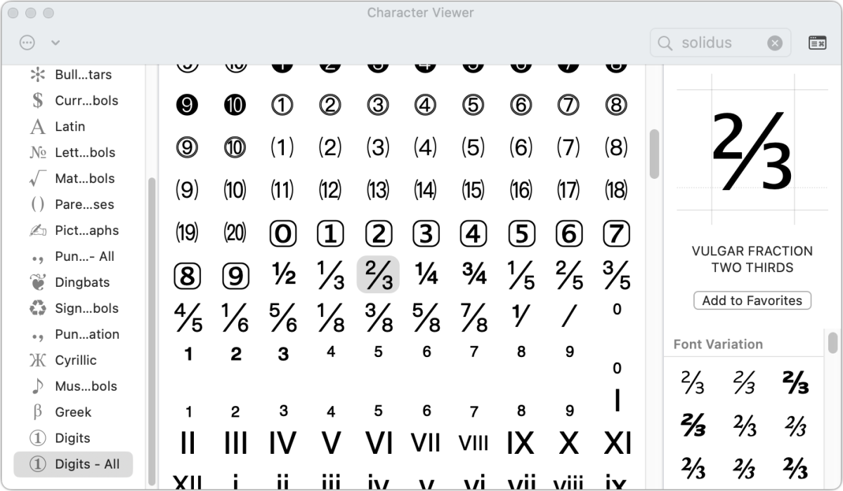
If you want to aim for something typographically consistent, you can access the drawn superscripts and subscripts in a font through the Character Viewer. If you don’t know how to access this palette, see “How to use macOS’s Character Viewer to type emoji and other symbols.”

Caption: The Character Viewer gives you direct access to choosing well-proportioned fractions.
The easiest way to use the Character Viewer to find fractions is to customize the display:
- Click the … (more) symbol in the upper-left corner.
- Choose Customize List.
- In the Symbols section, check the Digits – All box.
- Click Done.
Now when you bring up the palette and click Digits – All, you’ll see every number available in Unicode, which includes fractions and the characters for drawn superscripts and subscripts.
You can drag or double-click any item in the palette into a document. If you have the text insertion cursor at a point where you can enter text in Word or Pages, double-clicking inserts. Otherwise, drag the character into the document. If you copy (Command+C) the fraction and then paste it, it will paste the fraction and its character info; you can delete the unneeded info.
It can be annoying to scroll each time to find what you need. To bypass the scrolling, choose each fraction and click Add to Favorites under its preview at the right side of the viewer. Then you can click the Favorites link in the left-hand list.

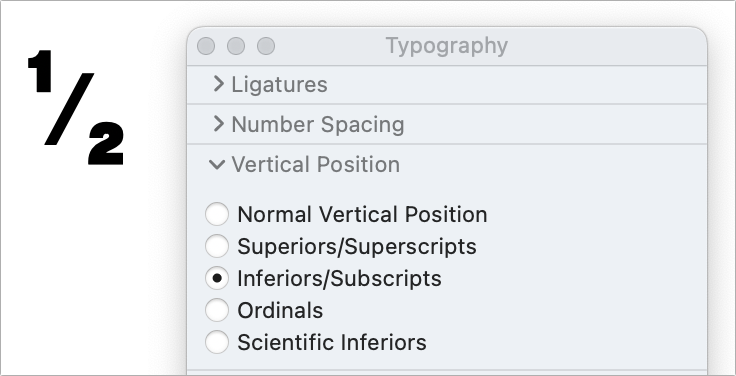
With the right typeface, you can use the Typography palette to construct a fraction.
Foundry
I’ve found that in some typefaces, the superscript 1, 2, and 3 don’t match the other numbers, likely for historic reasons. If you notice that difference, you have a workaround that relies on OpenType features you can access through the Typography palette in Pages only:
- Press Command-T to open the Fonts palette.
- Select a numeral in your Pages document.
- In the palette, click the More … button to select Typography and reveal the Typography palette.
- Click the Vertical Position section to show options, and choose Superiors/Superscripts or Inferiors/Subscripts as appropriate.
If the typeface contains the correct characters, you’ll then be able to compose perfect fractions. You may also need to adjust character spacing to make the fractions look just right: click the gear menu in the Format > Text palette and reduce Character Spacing.
Get the right forward slash
There’s one more subtlety you can invoke if you want to put the cherry on top of the fraction cake. There are several kinds of forward slashes in most typefaces and defined in the overarching Unicode format. A regular slash is about 20 degrees from the vertical; one used with a fraction is closer to 30 degrees. The fraction slash in a typeface fits more neatly with the drawn superscript and subscripts, and have the correct thickness of stroke to make it all look like a designed unit.
Search in the Character palette for “fraction slash” to find and fave that extra-special diagonal.
Build what you need
If you frequently need fractions, you could build a document with common fractions constructed from superscripts, fraction slash, and subscripts, and then copy and paste them in as needed into your main document. Or you could type normal fractions, like 5/8, and then search and replace for that text, replacing with drawn numbers like ⅝.
For all the latest Technology News Click Here
For the latest news and updates, follow us on Google News.
