Google Calendar in Gmail Revamped To Show An Elaborate And Engaging Email Invite | Digit
Reacting to Google Calendar invites on Gmail will be a tad bit easier thanks to the newly introduced changes. Well, not just easier, you will be better informed and find the interface more engaging too. The Gmail summary tab at the top will stay the same. But, it is the description box at the bottom that shows the details about the invite in a cleaner and clearer way.
Google Calendar Invite Redesign in Gmail

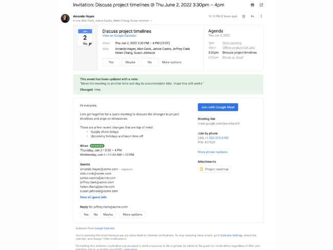
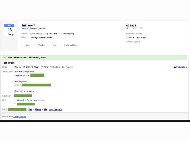
As mentioned above, the description box of the Gmail calendar invitation that sees the changes.
The position of certain things like the introductory paragraph, When (time of the event) and Guests (list of email IDs) are reorganized.
There are new features like Reply (an RSVP option) and a dedicated button for Google Meet along with a link. Previously, there was just a hyperlinked meeting link that could easily be missed in between other texts.
Also, if you make any changes to the invite, there will be an update banner saying, “The event has been updated with a note”.

These may appear subtle changes but Google thinks they will help you “quickly find and act on an event’s most important information.”
The company has begun rolling it out to all users and you should get it in the coming weeks.
As for other news, reviews, feature stories, buying guides, and everything else tech-related, keep reading Digit.in.
For all the latest Technology News Click Here
For the latest news and updates, follow us on Google News.
