Colour me crazy: Does anyone really need 2200 shades of paint?
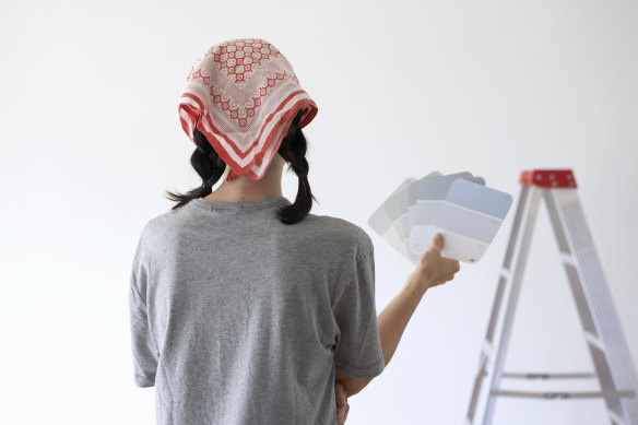
Many an amateur interior decorator knows the feeling. You’re at the hardware store, in the paint section, intently studying a small piece of coloured card. The colour is called Deep Desire. Or Cashew Crunch. Or Ancient Ruin. Do you like it? You’re not sure really. It is your third visit to the hardware store in 48 hours. Or possibly your fourth. It’s hard to be certain of anything any more, except that you’ve spent a lot of time browsing through racks of these cards, which represent the thousands of different hues marketed by various paint companies. On the previous visits, you gathered handfuls and took them home, along with several sample pots of paint. You held the cards against your walls, daubed the samples around the place, and decided that they all looked wrong. So, so wrong.
Now you’re back at what is known as “the colour wall”, determined not to lose heart. You pick up a card labelled Piglet. It is a pleasantly muddy shade of pink, similar to Cosmic Aura but more mushroomy. You try, without success, to visualise it in your bedroom. Perhaps you should flip to the other side of the palette and go with a green. Mermaid Tail? Leaping Lizard? Grassy Knoll?
Last time I was in this position, bamboozled at Bunnings, I reminded myself that in colouring our walls, we determine the environment in which we live. Different tones set different moods: cosy or cool, lush or austere. Our choices reflect our taste and character: whether we’re Rooti Tooti people or Drifting Cloud types. As UK paint and colour historian Patrick Baty wrote in his 2017 book The Anatomy of Colour: “An individual’s selection of colours says something about their conformist nature, their aspirations and their aesthetic sensitivity.” No wonder the level of anxiety in the paint aisle is high.
Loading
As I wavered between Sombrero Tan and Tomahawk that day, I resolved to do a little research into the factors that influence colour decisions – from personal yearnings to changing fashions. I decided, too, to investigate the naming of paint colours. Thunder Paws. Frost Fangs. Haunted Forest. Reluctant Raisin. Who dreams them up? Are they on drugs?
The onset of the COVID-19 pandemic triggered a national burst of enthusiasm for home decorating. Sales of house paint jumped by 6 per cent to about 164 million litres in 2020, says Bernard Lee, executive officer of the Australian Paint Manufacturers Federation. Sales fell back a little in 2021, as extended lockdowns in parts of the country prevented professional painters from working in occupied houses and closed hardware stores in some states, but Dulux’s colour and communications manager, Andrea Lucena-Orr, says the pandemic’s overall impact on the paint business was positive: large numbers of Australians, tired of staring at their walls, made up their minds to change the colour of them. “People who had never painted before suddenly decided to pick up a brush,” she says. The company’s helpline was inundated with calls – “not only from people wanting colour advice but also from people wanting to know how to paint”.
At Dulux, the country’s biggest-selling paint brand, additions to the range are named by teams that include chemists who create the colours, marketing staff and Lucena-Orr, who makes clear that she approaches the task in a sober and businesslike way. “It’s quite a process,” she says, explaining that each person comes up with a list of possible names. The best suggestions are tested against a database of 90,000 existing paint names, covering pretty much all that have ever been used by companies in Australia and New Zealand. In nine cases out of 10, says Lucena-Orr, the contenders are already registered. “You’ll look at a colour and go, ‘Wow, that should be Apricot Dream.’ Everyone goes, ‘Yeah, that’s a great name.’ Then we look at the database: Apricot Dream is gone.”
For inspiration, the teams flip through atlases (Winnipeg Fog, Greenland Ice, New England Stone) and cookbooks (Lime Parfait, Lemon Delicious, Chocolate Souffle). But there must be days when the job feels hard. Charity. Knowing. Answers. Village Square. These names from the Dulux colour chart sound like the desperate proposals of paint-namers who have sat at a meeting table batting around ideas for hours and just want to get out of the room. When I was thinking about having the outside of my house painted a couple of years ago, I came across a colour called Self-Destruct. I now wonder whether this was a colour-namer’s cry for help.

Consultants can advise those suffering from decision fatigue. One recalls visiting a house where 25 colours were painted on a wall.Credit:Getty Images
As it happens, Self-Destruct is one of several Dulux colours that have been renamed. It became Owl Wing (described as “a warm mid-tone neutral with an ochre-green undertone”). Assassin became Nautical View. Crazy became Marvellous Yellow. Apeland became Forest Vista. Blackbutt became Empty Stage. Ragin’ Cajun became Velvet Cushion. What else was replaced? “We had a colour called Funk,” Lucena-Orr says, enunciating the word carefully then spelling it: “F-U-N-K.” Nothing wrong with that in itself, “but obviously people can, um, misread it. If they’re reading fast. That’s now called Too Green.”
It turns out that there are people who make a living advising others what to paint on their walls. One of them, Melbourne colour consultant Pia White, says some of her customers have no colour sense at all: “You make a joke about it, and they’ll say, ‘Actually, I’m colour-blind.’ ” (One in 12 men have this condition.) At the other end of the spectrum are clients who know and care so much about the impact of colour that they’re willing to pay for expert guidance in much the same way that top tennis players retain the services of a coach. Then there are those who need saving from themselves. In this last group, White places the over-thinkers – people like me, who buy too many sample pots and tie themselves in knots trying to figure out which is the perfect option.
“You go into a paint store, or to Bunnings or any of those places, and there are 3000 colours. Sometimes there’s just too much choice.”
She was once called to a house where 25 colours had been painted in squares on a wall. “I couldn’t believe it,” she says. “That poor woman. She was overwhelmed.” White laughs, but not in an unkind way. She understands that, faced with the plethora of hues available, some of us temporarily lose our grip. “You go into a paint store, or to Bunnings or any of those places, and there are 3000 colours,” she says. “Sometimes there’s just too much choice.”
According to Sarah Yap, marketing manager at Taubmans, Australia’s second most popular paint brand, homeowners make an average of seven trips to the colour wall before deciding on a shade to buy. To Rachel Lacy, Taubmans’ colour category manager, the value of almost limitless choice is debatable. “Are we really serving the consumer well by offering 2200 colours?” she asks. “I think there’s a lot to be said for a much more curated palette.”
Having worked in colour consulting, Lacy knows the symptoms of decision fatigue: “I mean, we’re not curing cancer here, but there is satisfaction in taking someone who’s frustrated and frazzled and saying to them, ‘It’s okay. Just take a couple of breaths and we’ll whittle this down.’ ”
Loading
Farrow & Ball, perhaps the world’s most upmarket paint manufacturer, does the whittling on its customers’ behalf. Based in Dorset, in south-west England, the company offers just 278 colours – 156 in its current collection and 122 from its archives. Many Farrow & Ball shades have a muted, antique appearance and those who invest in them (they’re not sold in Australia) are essentially paying a great deal of money – £100 ($180) per five-litre tin – for paint they hope will look like it was applied a century ago.
The company has long been known for its idiosyncratic approach to colour-naming. Along with Elephant’s Breath (which its website explains is an uplifting mid-grey with a hint of magenta) and Churlish Green (“from the old English definition relating to simple peasant life”) Farrow & Ball’s list includes such memorable labels as Arsenic, Dead Salmon and Mizzle (a colloquial term for precipitation that’s halfway between mist and drizzle).
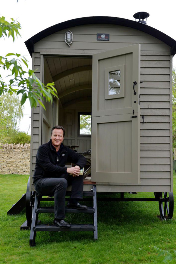
When former British Conservative prime minister David Cameron spent £25,000 in 2017 on a hand-built “shepherd’s hut” for his Cotswolds garden, he had the exterior painted in Farrow & Ball’s Mouse’s Back. As journalist Rebecca Mead wrote in a 2019 article in The New Yorker: “If Farrow & Ball had existed in France in the 18th century, it would have been Marie Antoinette’s first choice for decorating the Petit Trianon.”

Former UK prime minister David Cameron selected the shade Mouse’s Back for his “shepherd’s hut”.Credit:RED SKY SHEPHERDS HUTS/GRAHAM FLACK
Paint is a liquid that, when spread over a surface, dries to a solid coating. Its purpose may be as practical as it is decorative. Taubmans’ Sarah Yap says demand for paints that inhibit mould and mildew growth have risen in the past couple of years, particularly in areas of eastern Australia that have been drenched by record rainfall. She also notes that almost half the house paint bought in this country is white – a statistic that makes perfect sense to Real Estate Institute of Australia president, Hayden Groves. “Neutral, pale walls give the impression that rooms are big and airy and bright,” says Groves. Consequently, real estate agents tell prospective vendors that pale paint is likely to help them get the best price. “Mostly, an off-white colour
is recommended.”
Bold and murky shades can be polarising. For every person who adores a deep blue-grey like Baltica, or a purple-red infused charcoal like Oboe d’Amore, there’s someone who hates it. “Buyers will make the comment, ‘Look, the house meets our needs, it’s really nice, but gee, the colour scheme is awful,’ ” Groves says. “And they won’t proceed on that basis.” In his experience, pointing out that they could quite easily repaint the place rarely changes their minds. So the best plan is for vendors to present a property as a blank canvas: “You’re trying to make it appeal to as broad an audience as possible.”
Groves’s own house is painted from end to end in a neutral colour, Hog Bristle. “Hog Bristle quarter-strength, actually,” he says. “If it was full-strength it would be too …” Too much like a hog bristle? “Yes. If you go down to a quarter-strength, it’s quite a lovely tone.”
“You want your interior to be for you, not someone who may or may not buy your house in 10 years’ time.”
The practice of playing it safe to avoid offending the tastes of possible future buyers is not endorsed by Melbourne colour consultant Rachel Rimmer. “You want your interior to be for you, not someone who may or may not buy your house in 10 years’ time,” she says. Rimmer tells her clients that, in any case, white isn’t as straightforward an option as many imagine. “It can be tricky to get right. In a paint range, there might be one that’s a pure white, which has nothing else added to it. All the other whites have little bits of other colours added to them. Whites can be warm, with a yellow or pink or brown base, or they can be cool, with a blue or green or grey base.”
It’s even more complicated than that. “Some of the newer whites have a foot in both camps,” says Rimmer. “They might have a little bit of warmth but a little bit of grey in them, too.” A consultant might well be engaged solely to offer counsel on which monochromatic tones would work best in a particular setting. Says Taubmans’ Rachel Lacy: “Agonising choices are made between two fractionally different shades of white.”
John Fowler, one of the most influential British interior designers of the 20th century – he’s credited with creating the English country-house look – believed paint should be fun. (He and his business partner, Nancy Lancaster, catered to an aristocratic clientele and invented their own jokey colour names. Lancaster coined “caca du dauphin” and “vomitesse de la reine”.) Nevertheless, Fowler’s paint jobs could be fantastically finicky.
According to his biographer, Martin Wood, he used 12 different tones of white to highlight the architectural detail in the Robert Adam-designed great hall at Syon House, owned by the Duke of Northumberland.
In the Savile Row salon of fashion designer Hardy Amies, Fowler made do with three tones of white. Amies said later that he kept the colour scheme while the decorator was alive – “but once he was dead, we just painted it white. Having it three whites, you know, never sold another f…ing frock.”
Grey was the favoured shade of fashion-conscious home decorators at the beginning of the 21st century. I confess to Dulux’s Andrea Lucena-Orr that I’m glad that era is over. “You and me both,” she says with feeling. “It was a long, grey decade.”

Post-pandemic, people are gravitating towards warmer, more welcoming colours.Credit:Stocksy
Green is the new big thing. As the German poet Goethe wrote in 1810, during one of its earlier periods at the top of the paint charts, “The eye experiences a distinctly grateful impression from this colour … The beholder has neither the wish nor the power to imagine a state beyond it. Hence, for rooms to live in constantly, the green colour is most generally selected.” In Goethe’s time, pea-green in particular was modish. These days, the preference is for a soft grey-green, like the colour of gum leaves.
Loading
Also popular? “Very earthy, pinky terracottas,” says Rowena Davies, colour specialist at family-owned paint company Murobond (whose colour collection includes such beguiling names as Billabong, Bandicoot, Banksia and Dirty Wombat). In 30 years in the business, watching trends come and go, Davies has never tired of helping customers embarking on painting projects. “A lot of people have absolutely no idea where to start,” she says. Others don’t know when to stop. “I’ve got a lady who changes her front door every season. Which is great.”
Sydney interior designer Juliette Arent welcomes a general move away from a cool, hard-edged look towards warmer, more welcoming colours. “I think that has come out of people being at home more, and wanting to feel safe and protected,” she says.
Arent’s favourite neutral tone is Bongo Drum, and not only for its name. “It has a very strong pinky, beigey tinge, which makes everything feel soft and friendly. It just feels inviting.”
Unless you’re a Farrow & Ball customer, painting a wall is a relatively inexpensive way to transform a space. What’s more, says Taubmans’ Rachel Lacy, it is quick: “You can change the colour of your bedroom in a weekend and it can bring a huge amount of satisfaction.”
Or not. Many of us know the feeling of standing back and realising we’ve made a hideous mistake. Dulcet Violet! What were we thinking? I’m actually quite pleased with Tomahawk, the pinky-brown shade I chose after protracted prevarication in the paint aisle, but when I first climbed off the ladder and looked at a whole wall of it, I felt a distinct tremor of doubt. Colour consultant Pia White thinks we should all relax. “The thing with paint – if you’re not happy with it, you can paint it again,” she says briskly. “It’s not the end of the world.”
To read more from Good Weekend magazine, visit our page at The Sydney Morning Herald, The Age and Brisbane Times.
For all the latest Life Style News Click Here
For the latest news and updates, follow us on Google News.
