Apple’s Dynamic Island is intrusive and I’m still not a fan
I’m still not sold on the iPhone 14 Pro’s Dynamic Island. When the feature was introduced during the company’s iPhone event last month, I was excited. It looked incredible. It looked sleek. It appeared, at a glance, to be the quintessential Apple feature. Some even heralded it as a triumph of Apple design, the culmination of Apple’s obsession with controlling both its hardware and software. But as I’ve used the Dynamic Island more and more, I’ve found it to be more useful in theory than in practice.
My main gripe is that I find the Dynamic Island distracting. I wasn’t a fan of the notch on the iPhone X when Apple first introduced it. But it just took a few days for it to fade into the background.
The Dynamic Island, however, isn’t designed to fade into the background. It’s designed to be at the forefront. While many people praised Apple for adding utility to the camera and Face ID cutouts, I’m still not convinced the positives outweigh the negatives.
Why the Dynamic Island is intrusive
As an illustrative example, I love listening to music and podcasts on the iPhone. But doing so on the iPhone 14 Pro is, to be blunt, annoying. Seeing the audio waveforms as I scroll through Twitter, or browse photos on my phone, or peruse the web, is unbelievably distracting. And while it’s possible to swipe and turn the waveforms off, it’s yet another “to-do.”
Moreover, the waveforms reappear every time I switch to a different app. So if I swipe the audio waveforms off while I’m in Safari, they reappear when I hop to Messages to respond to a text. If I turn them off there, they reappear when I go back to Safari.
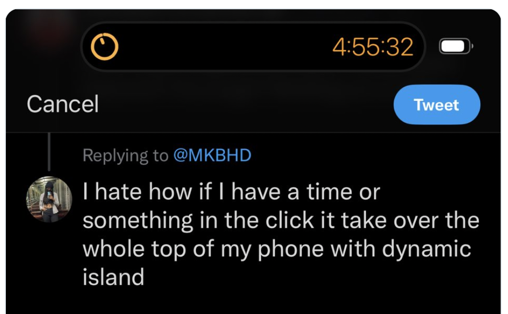
Here’s a similar complaint from someone on Twitter:

And yes, you can swipe to make this smaller, but again, why force users to do more work? What if some users don’t need or want to see their timer countdown to zero in real-time?
Placement is also an issue
Dynamic Island notifications aside, its placement is also something of an eyesore. Maybe I will get used to it eventually, but because the Dynamic Island sits lower on the display, it’s always there, glaring back at me. No matter what app I’m using, I can’t help but see it whereas the notch faded into the background.
Which photo here looks like a subpar user experience?
Dynamic Island needs customization options
I get that Dynamic Island is a huge selling point of the iPhone 14 Pro. And I get that Apple wants us to interact with it to make it normalized. But forcing it upon users without an option to turn it off completely is disappointing. At the very least, Apple should provide users with an option to pick and choose which apps they’d like to take advantage of the Dynamic Island.
After all, there are certainly use cases where the Dynamic Island can shine. Seeing how far away your Uber is or keeping tabs on sports scores are two examples. But until Apple provides users with a setting to customize Dynamic Island exactly to their liking, the entire feature feels overbearing and intrusive.
Hopefully with a few more weeks of usage, and as apps continue to optimize for it, I’ll grow to enjoy the Dynamic Island in the same way I grew to enjoy the notch design. But for now, the lack of customization is frustrating and user-unfriendly.
For all the latest Technology News Click Here
For the latest news and updates, follow us on Google News.
