How to edit photos on iPhone
Knowing how to edit photos on iPhone will let you fine tune the look of your photos, making them nicer to look at and helping them stand out on social media.
As a photographer who regularly uses some of the best photo editing software, I still find it amazing that the iPhone comes with such a brilliant photo editing app built right in to the Photos application, allowing me to adjust the exposure, highlights, shadows and color profiles of my images.
Sure, the Photos app editor is not a replacement for Adobe Lightroom. It’s not suitable for editing the high resolution RAW files from my mirrorless camera to exhibition level. However, for quickly adjusting and perfecting my quick snaps using the brilliant camera on my iPhone 13 Pro Max, it’s fantastic, and in my opinion is a big part of what makes the iPhone one the best phones out there (and certainly the best phone for me).
If you’ve not used the Photos editor yet, or if you’ve only touched the surface by using the basic crop and auto touch up features, you may find the thought of using the more detailed sliders a bit daunting. Well, fear not, we’re here to talk you through using the Photos editor to its fullest extent, explaining the theory behind what you’ll be doing. In no time at all, you’ll be editing your photos like a pro. And if you wind up being unhappy with how an image looks, don’t worry, as there’s a simple way to under all of the changes you make.
Without any further beating around the bush, here’s how to edit photos on iPhone.
How to edit photos on iPhone
The first thing you’ll need to do is find an image to edit, then open up the Edit feature.
1. Open Photos and find an image to edit.
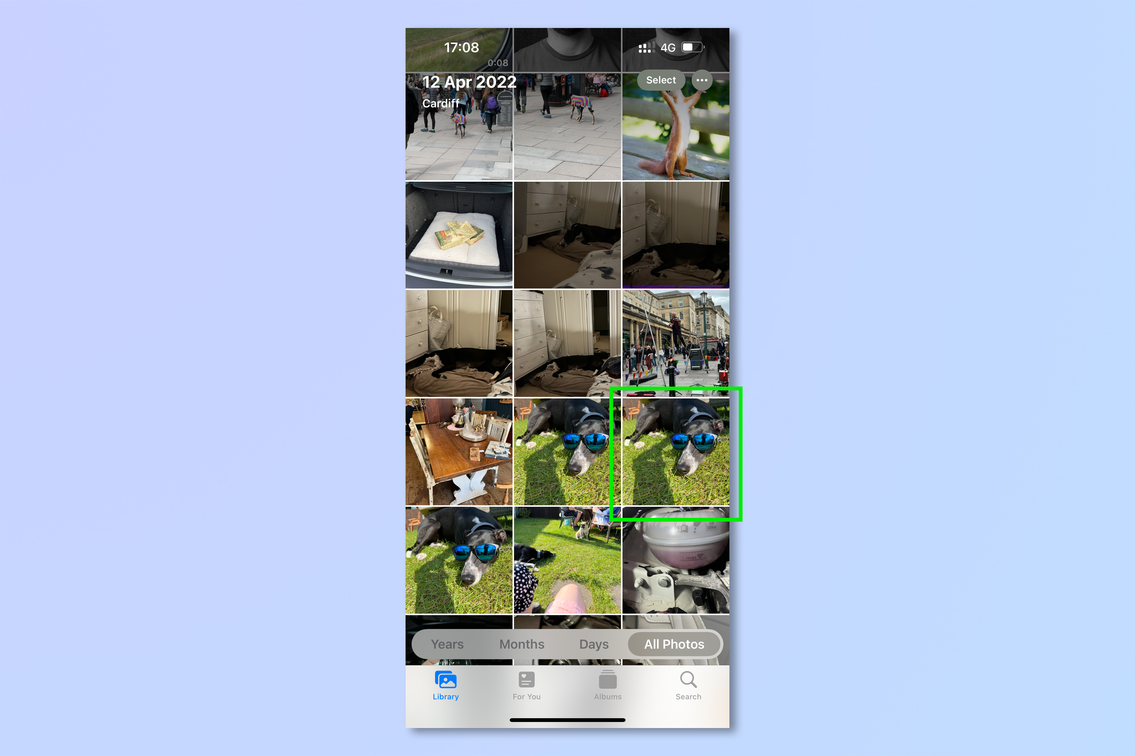
2. Tap on the image, then tap Edit.
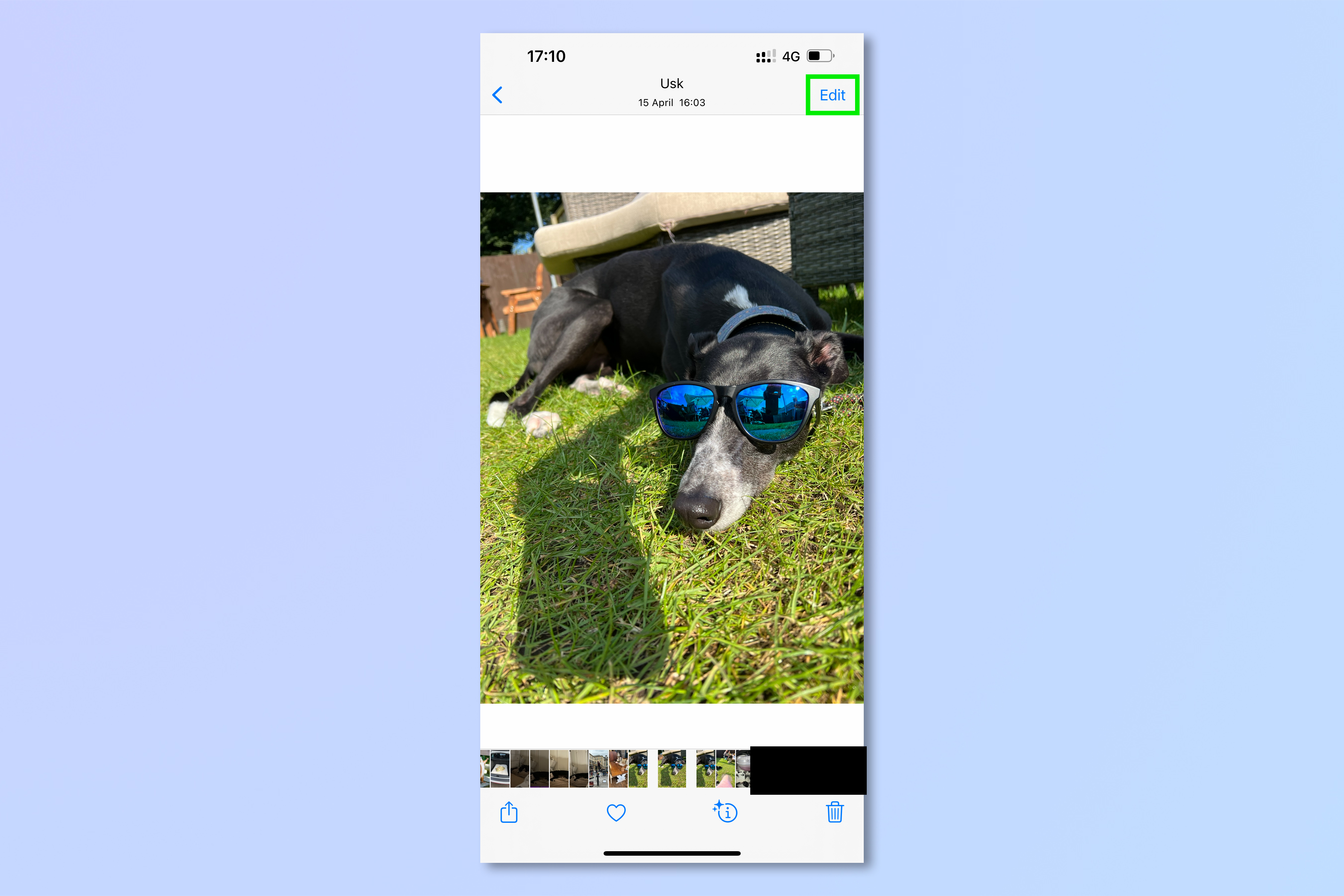
Get to grips with the Edit menus
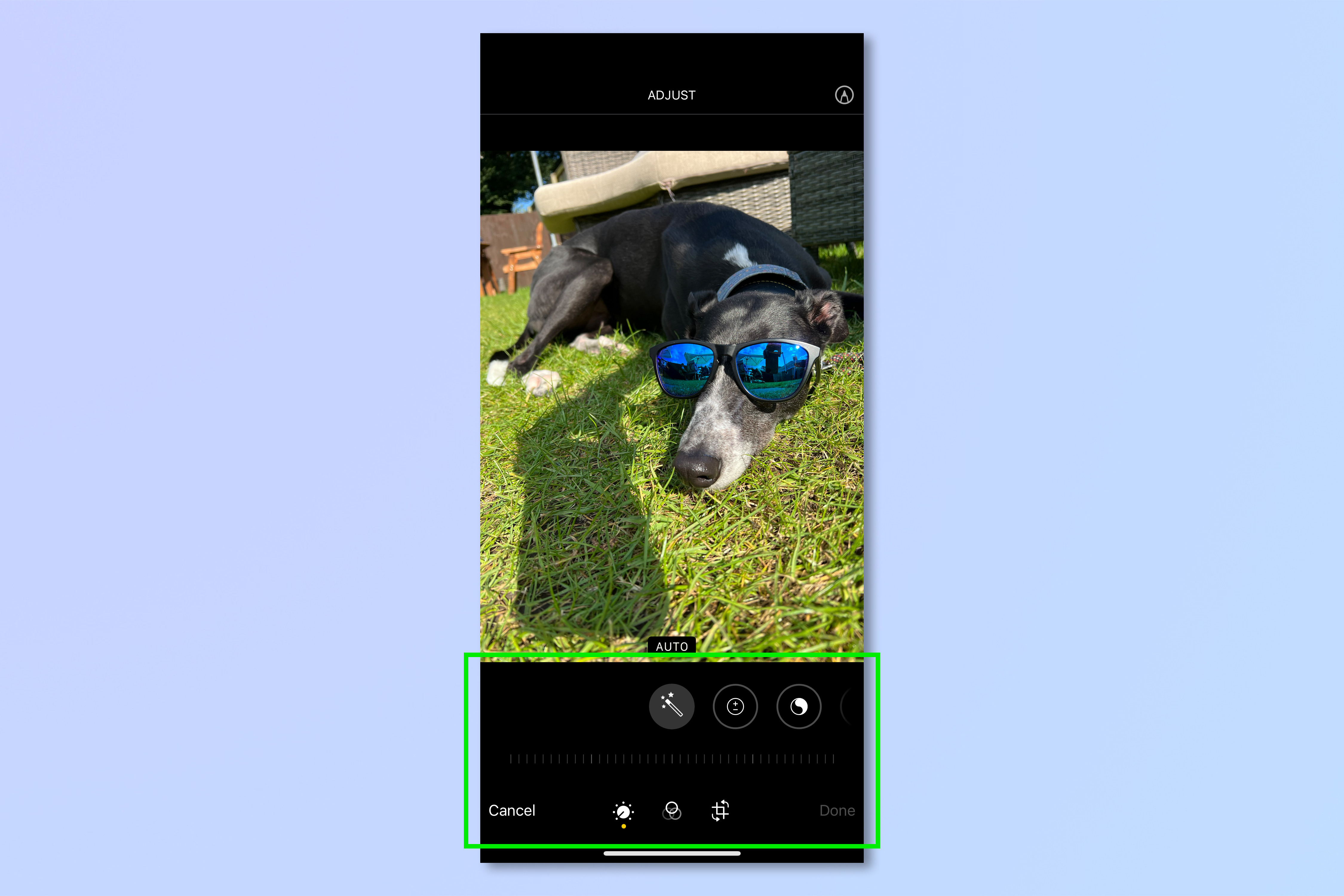
As soon as you tap Edit, you’ll be taken to the image editing application. We’ll go through it here from the bottom up.
At the very base of the screen you’ll see three options for the different primary editing panels. (There will be a fourth menu for lighting if you’ve taken a photo in Portrait mode, but here we’ll just focus on the three basic editing panels.) The dial icon represents the Adjust panel, where you can edit the individual attributes of an image. The three circles represent the Filters panel, where you can apply different filters to alter the overall feel of your image. The Crop icon represents the transform panel, where you can crop, rotate and flip images.
Above these menus is a slider bar that looks like a ruler. This is how you will scale adjustments and increase or decrease the intensity of filters or transformations.
Above the slider bar is a set of icons which represents the different options you have, be they adjustments, filters or transformations.
There’s the basics down. Now we’re going to go into more detail about how to use each panel.
Using the Adjust panel
If you want to edit your photos on iPhone, you’ll need to get familiar with the adjustment sliders, and understand what they do. This is the meat of image editing, and what you do here is really very similar to how a pro will edit their images in Adobe Lightroom or similar software.
There’s a few things to get to grips with first, however. First, you need to understand that your image is made up of a variety of different tonal ranges. There are highlights, which are the very lightest range of tones in your image. There are whites or lights, which are the lighter tones. There are shadows, which are the darker parts of your image, then there are blacks, which are the darkest parts. Your image, if it’s in color, also feature colors, which fall into the above tonal ranges. Now, it’s time to get editing.
Adjusting your image: Auto
Tap the Auto option (the icon that looks like a wand) to auto adjust your image in the toolbar at the bottom — this is great for quick fixes on the go. Use the slider bar to adjust how intense you want the auto edits to be. To undo any changes, tap Cancel, then tap Discard Changes.
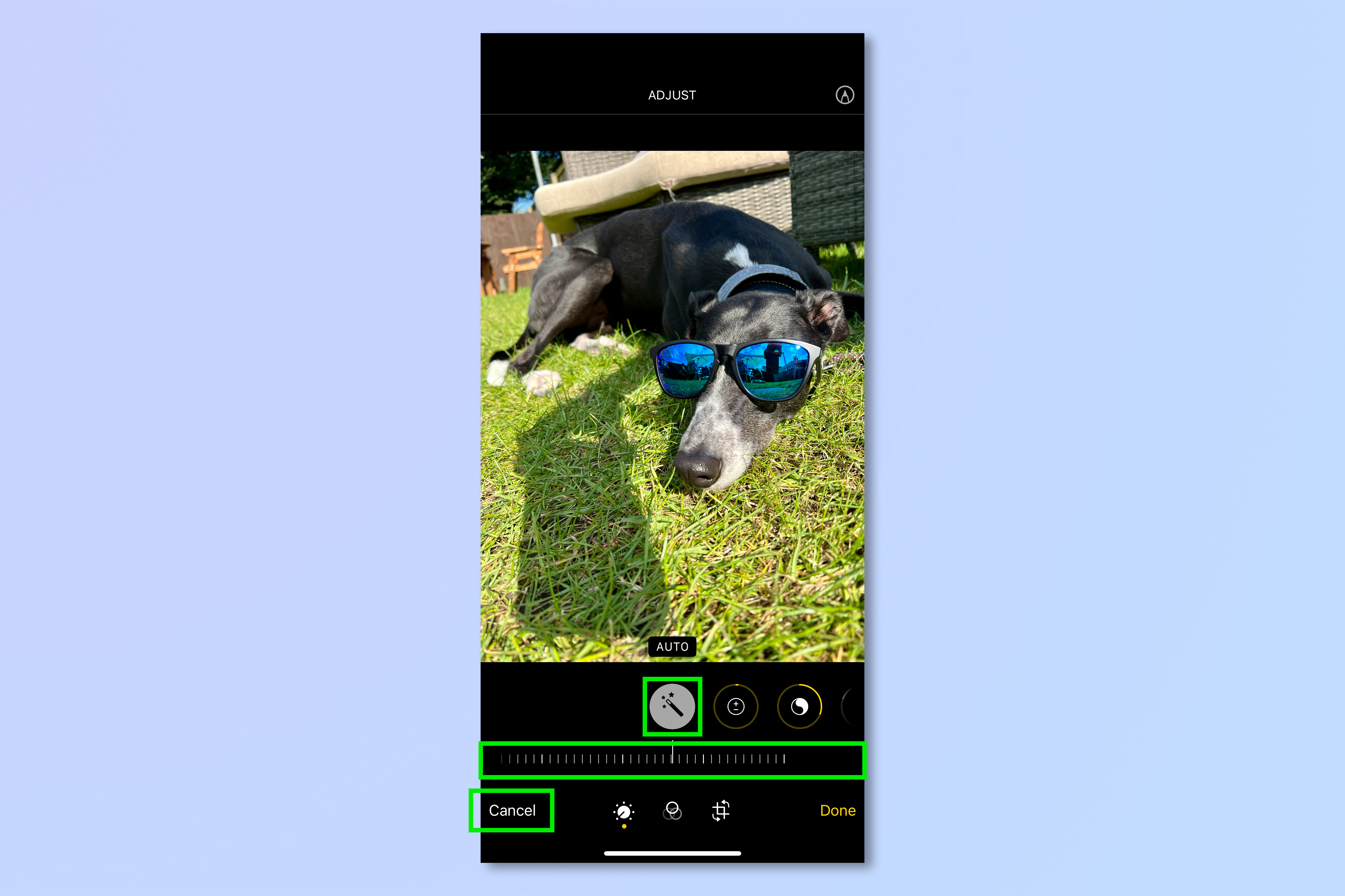
If you’d prefer more control over how you edit your image, try editing different parameters separately. Tap Auto again to remove the automatic corrections, then swipe to the left on the toolbar and tap the individual circular icons to switch to different editing areas. We’ll cover those one by one.
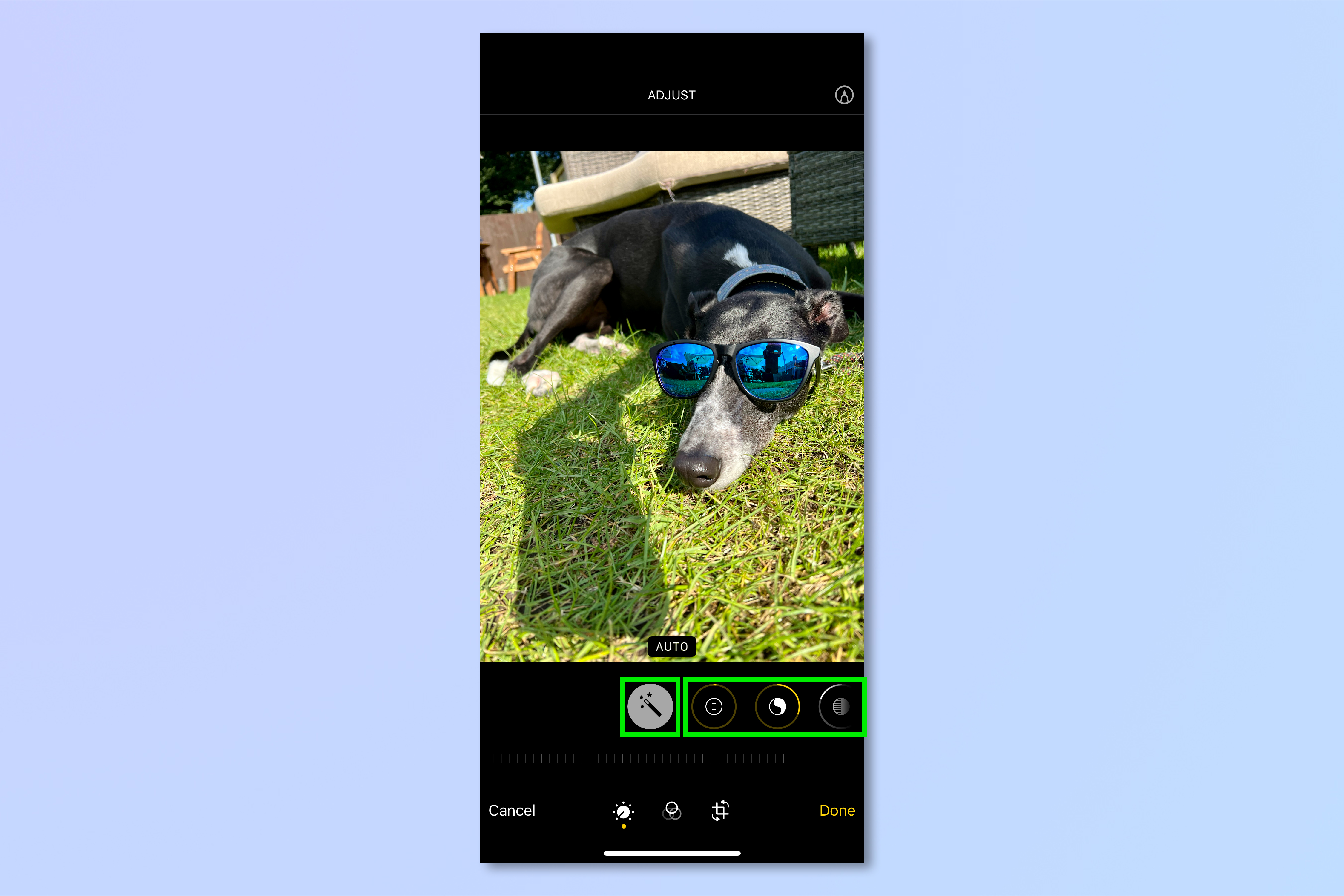
Adjusting your image: Exposure
The first editing area is Exposure, which is the most general slider, adjusting the brightness of your entire image by brightening all tones equally from highlights to blacks. Exposure is a photographic term essentially meaning how long your camera’s sensor was exposed to light, so how bright or dark the image is. Adjust the slider to the right to raise the exposure and brighten your image if it’s too dark. Adjust it left to lower the exposure and darken your image if it’s too bright.
This is a bit of a blunt tool, so if there are already bright spots in your image, upping the exposure slider could blow them out.

Adjusting your image: Brilliance
The next area to adjust is Brilliance. Adjust the Brilliance slider to the right to add contrast, while simultaneously brightening dark areas of your image and scaling back highlights. This slider is an easy way to make a photo more vivid.
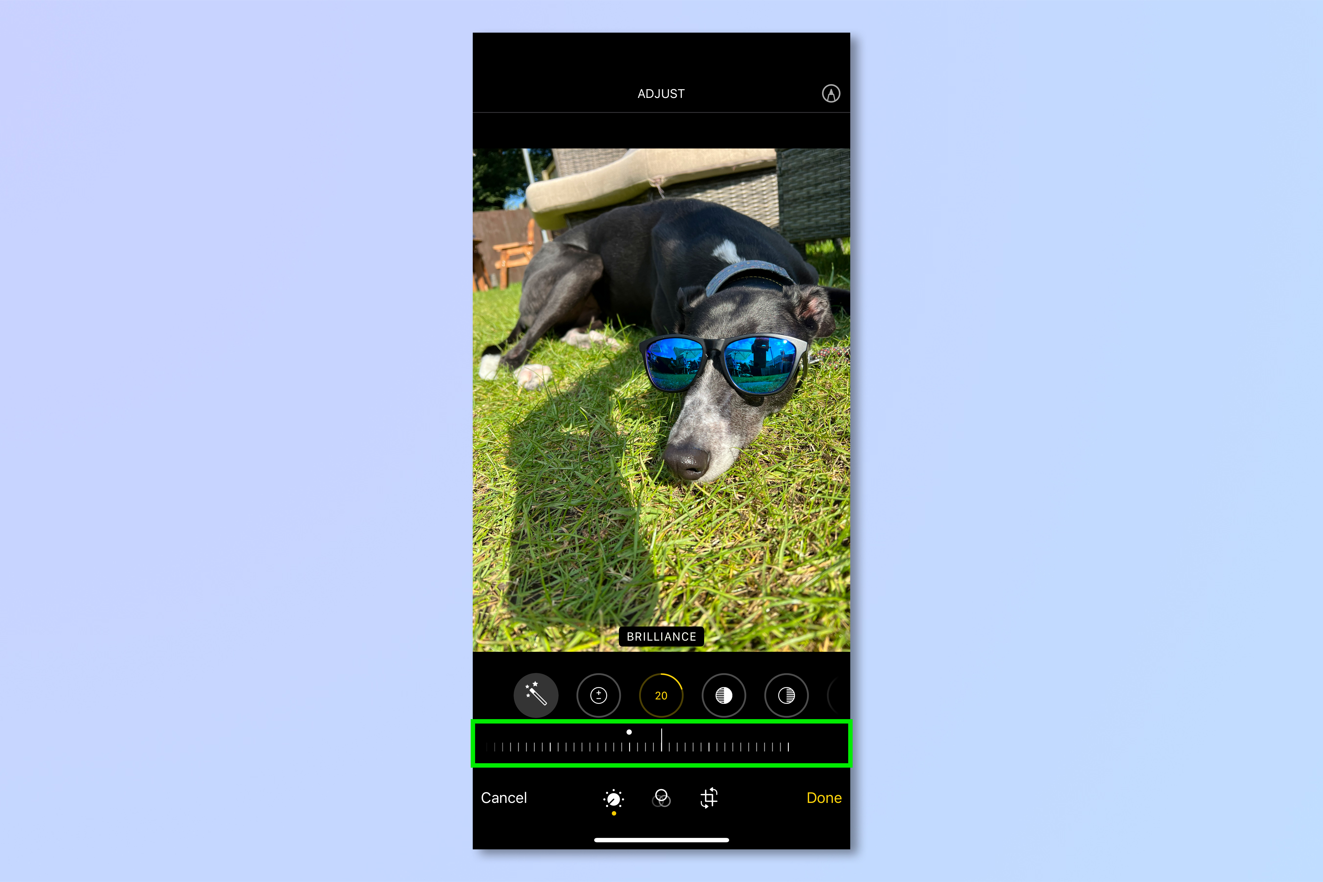
Adjusting your image: Highlights
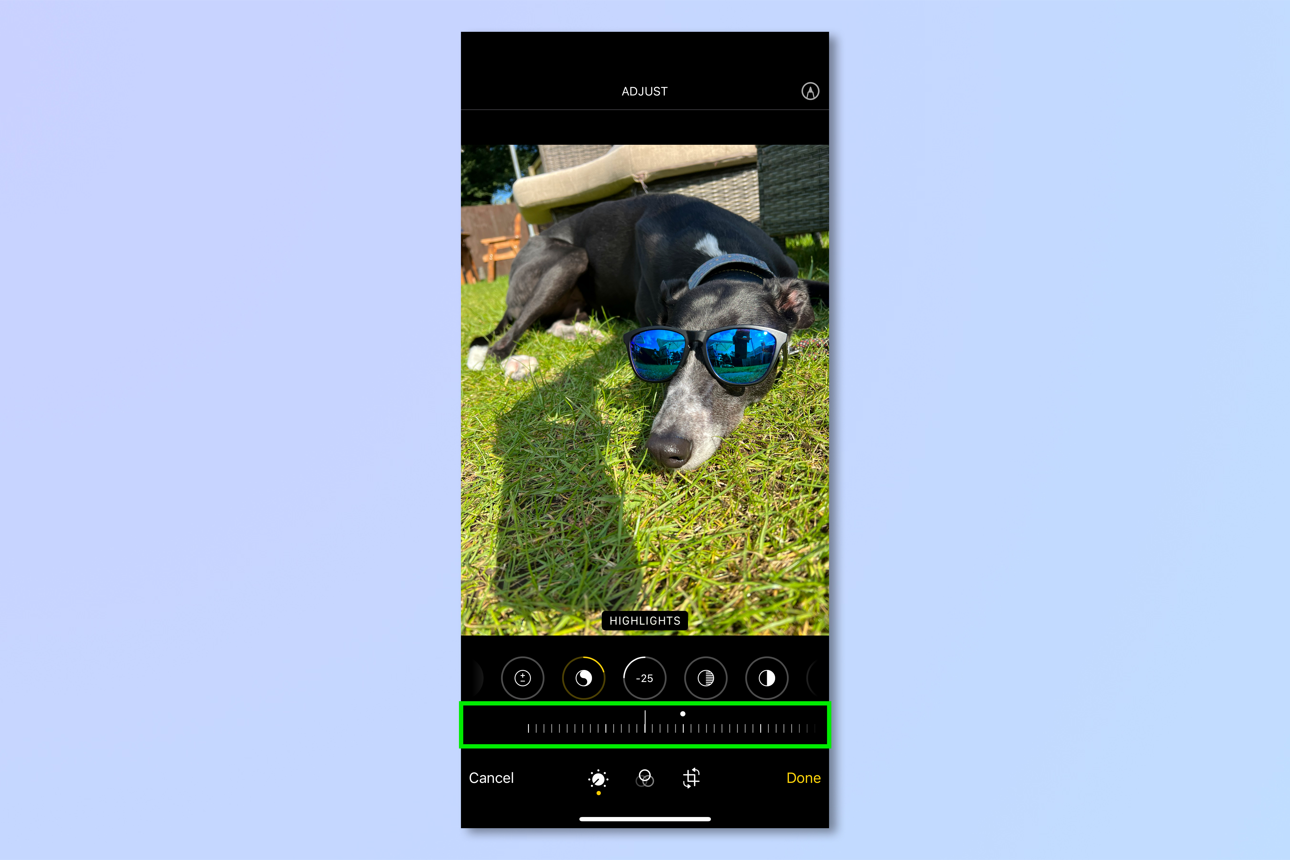
Highlights are often overly bright versus the rest of the photo, if you’ve taken a picture in bright light, for example. Pull the highlights slider to the right to lower highlights and dampen any excessively bright patches in isolation to the rest of your image. You’ll definitely want to do this if you have bright spots in your image but need to up the exposure of your image generally to lighten other dark areas. Otherwise, when you raise Exposure, you may ‘blow’ highlights (see below). It is not as common to raise highlights, but you may need to if light tones in your image could do with a lift. Pull the slider to the left to lift highlights.
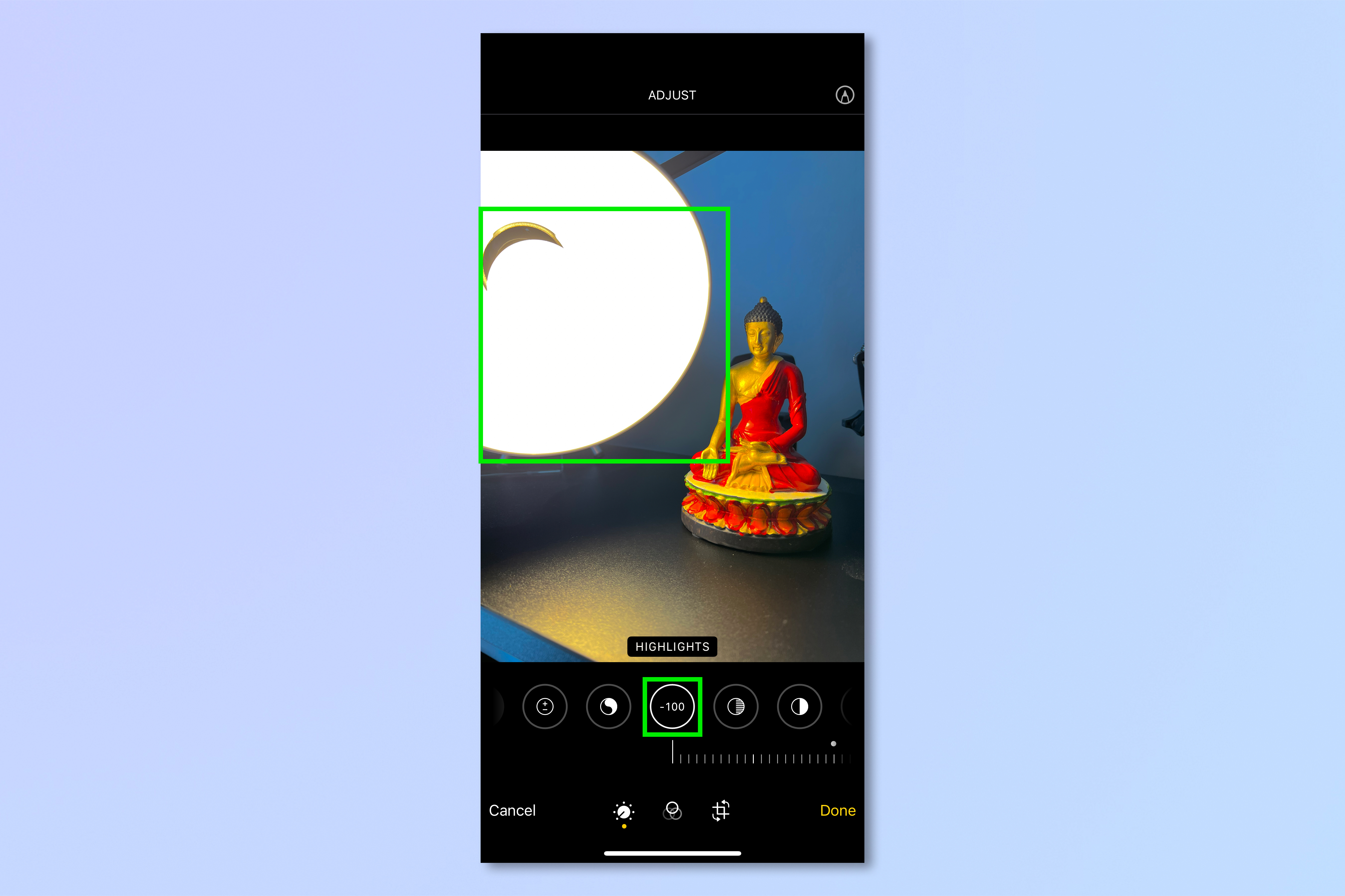
What are ‘blown’ highlights?
Blown highlights describes a situation where there is so much light in an area of the photo that nothing in that area can be made out, and detail is lost. Kind of like when you look at a bright light and can’t make anything out around it. In the image below, you’ll notice the lamp light is so bright that you can’t see the inside of the lampshade or make out any detail of the lightbulb. In that area, the highlights are blown out. If this happens in camera, there isn’t much you can do about it, even if you pull the highlights down when editing, as demonstrated in the screenshot where highlights are set at -100. In these cases, the only fix is to reshoot the image.
Adjusting your image: Shadows
Lifting shadows brightens the darker areas of your image, balancing the tonal appearance of your image. Contrary to blown out highlights, if an area appears too dark in an image, details are often not lost. This means lifting shadows can sometimes reveal hidden things that were obscured by darkness before editing the image. Pull the slider to the left to raise shadows, and to the right to lower shadows them.
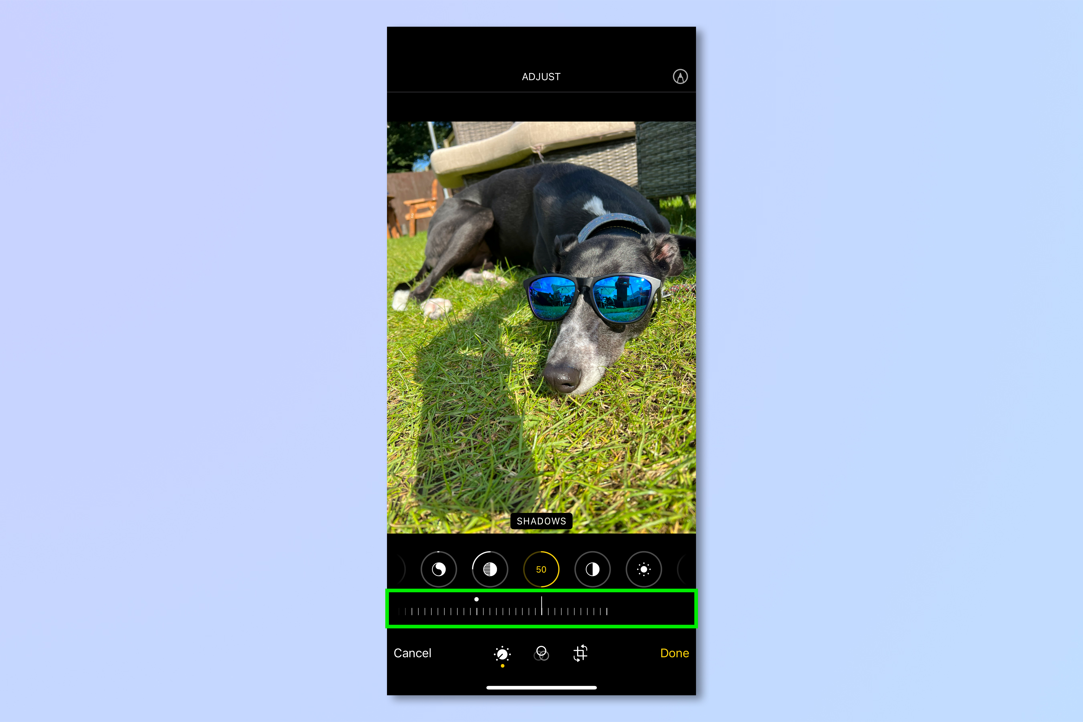
Adjusting your image: Contrast
Raising contrast increases the difference between the tones of your image, making individual tones stand out from each other and giving a more dramatic effect. Lowering contrast does the opposite, giving a softer, more ethereal effect. Pull the slider to the left to raise contrast, and to the right to lower it, according to preference.
Remember that adding too much contrast can lead to an image looking artificial (the image on the left) or ‘over edited’, while lowering it too much can lead to an image looking washed out (the image on the right). Try to strike a balance, but remember editing images is all about personal preference, so do what you think looks good.

Adjusting your image: Brightness
Adjusting Brightness is very similar to Exposure, in that it will make your image brighter. Brightness does not lift the very brightest of highlights, however, so adjusting Brightness upward will not risk blowing out highlights as much as adding Exposure. Pull the slider to the right to lower brightness and to the left to increase it.
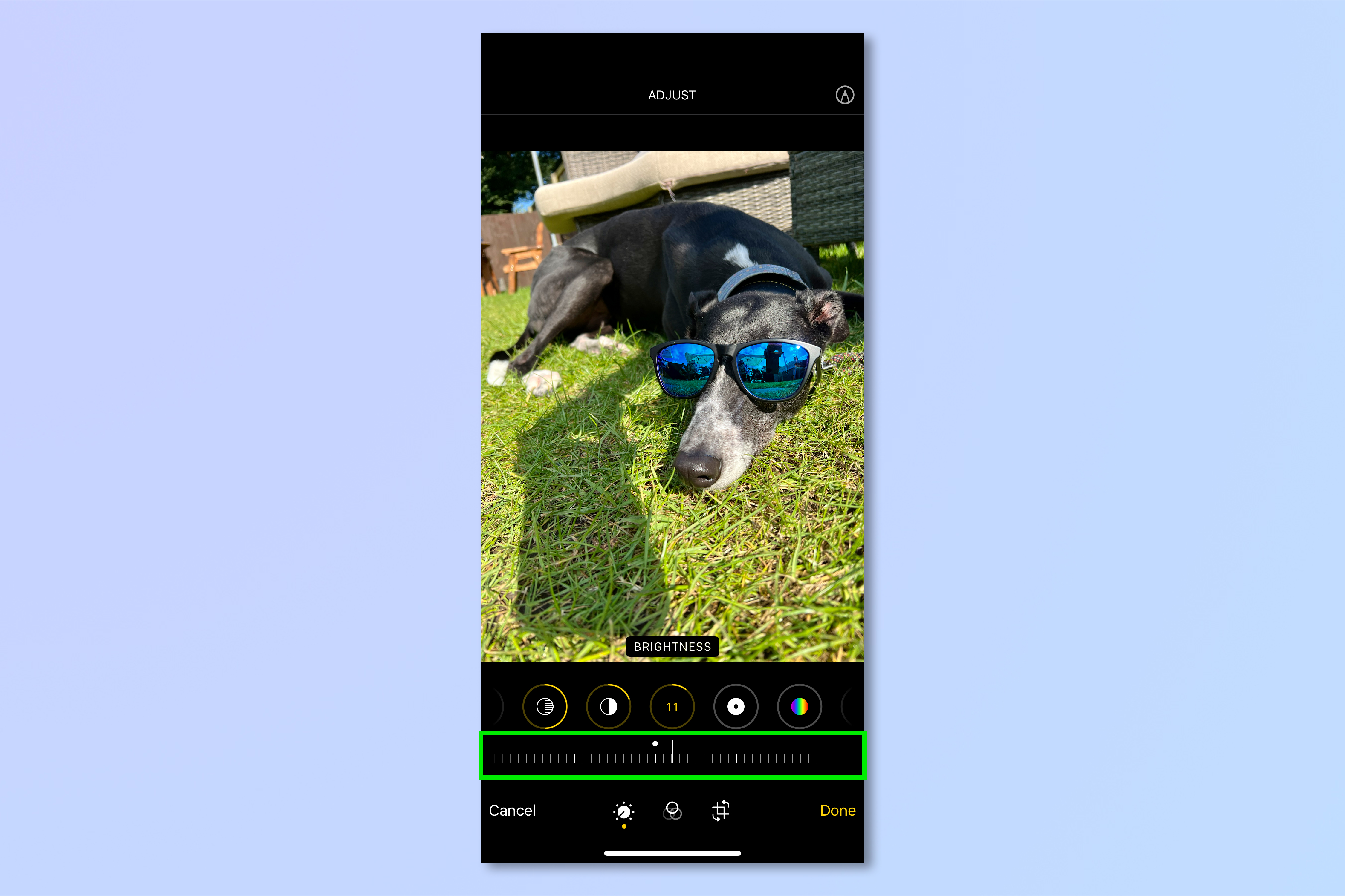
Adjusting your image: Black Point
Setting the Black Point higher will add darkness to the dark parts of your image, giving them more depth and increasing the contrast of the image. Pull the slider to the left to raise the black point and darken already dark areas, and to the right to lower the black point and brighten them.

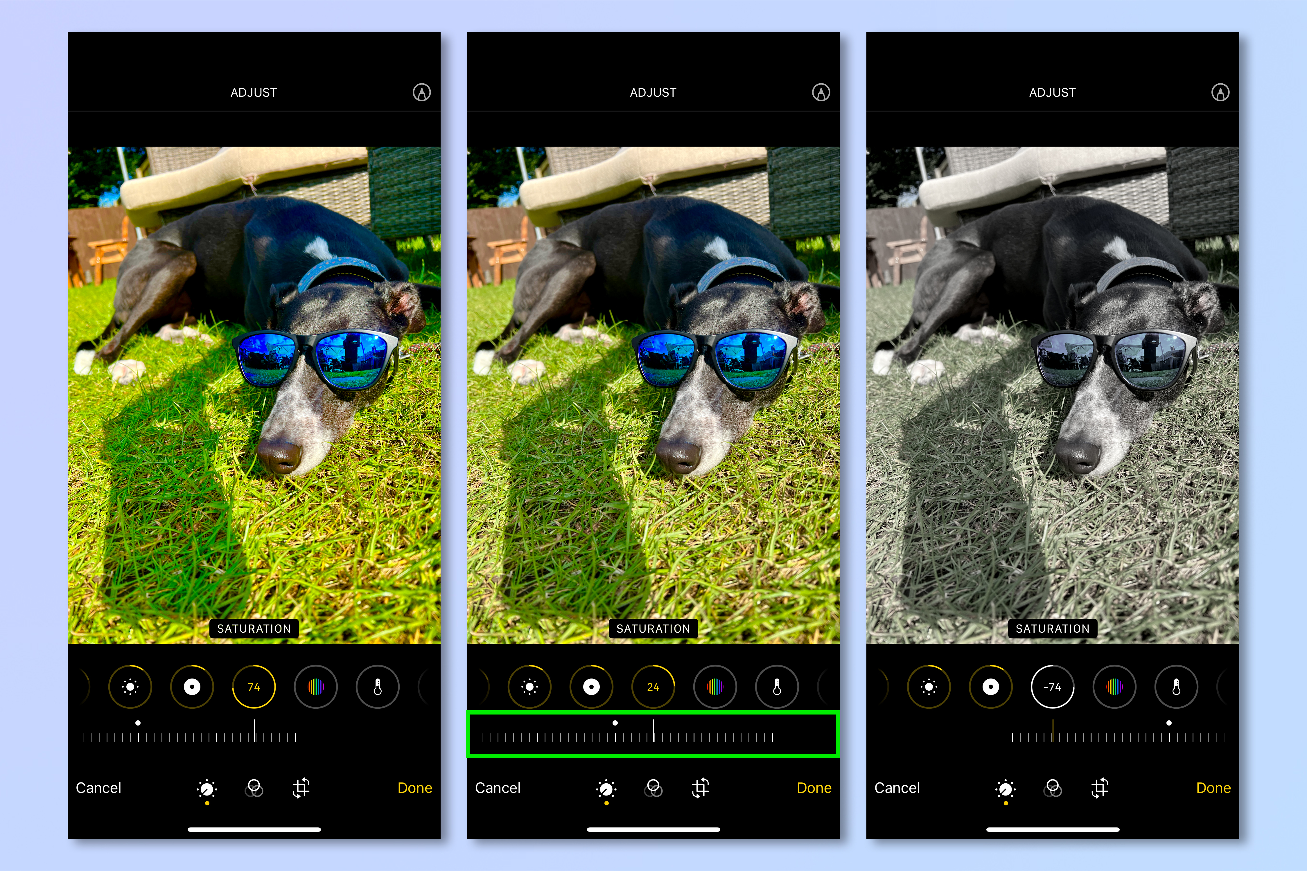
Adjusting your image: Saturation
By increasing the saturation of an image, you increase the intensity of the colors within it. Pull the Saturation slider to the left to increase saturation, and to the right to decease it. Too much saturation will look artificial (left image), whereas too little will look washed out (right image). Try to strike a balance, but remember editing images is all about personal preference, so do what you think looks good.
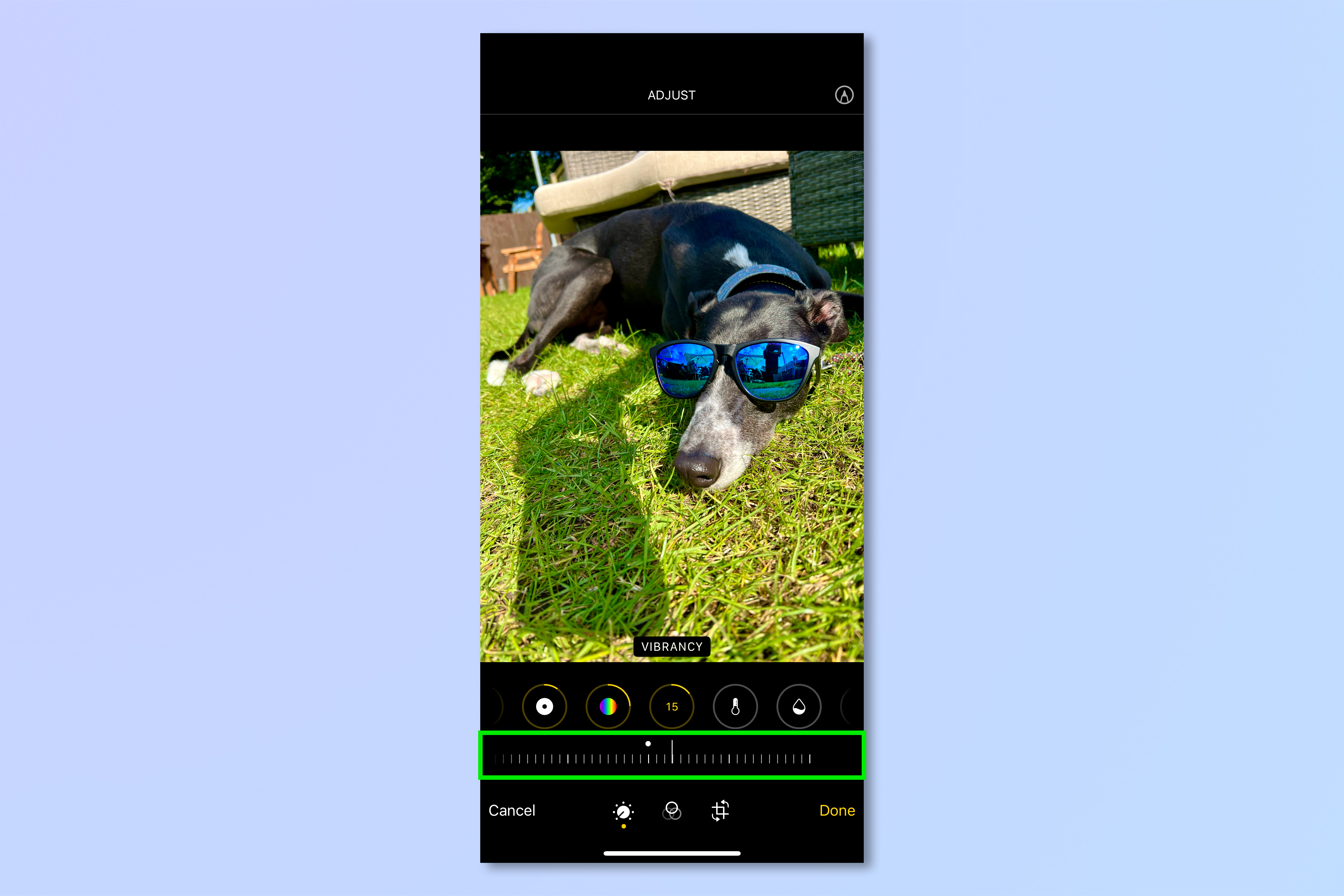
Adjusting your image: Vibrancy
The Vibrancy slider adds saturation to an image only in parts where the colors are not already saturated. As such, increasing vibrancy can look more natural than increasing saturation, and is a little more forgiving. Pull the Vibrancy slider to the left to increase vibrancy, and right to decrease it.
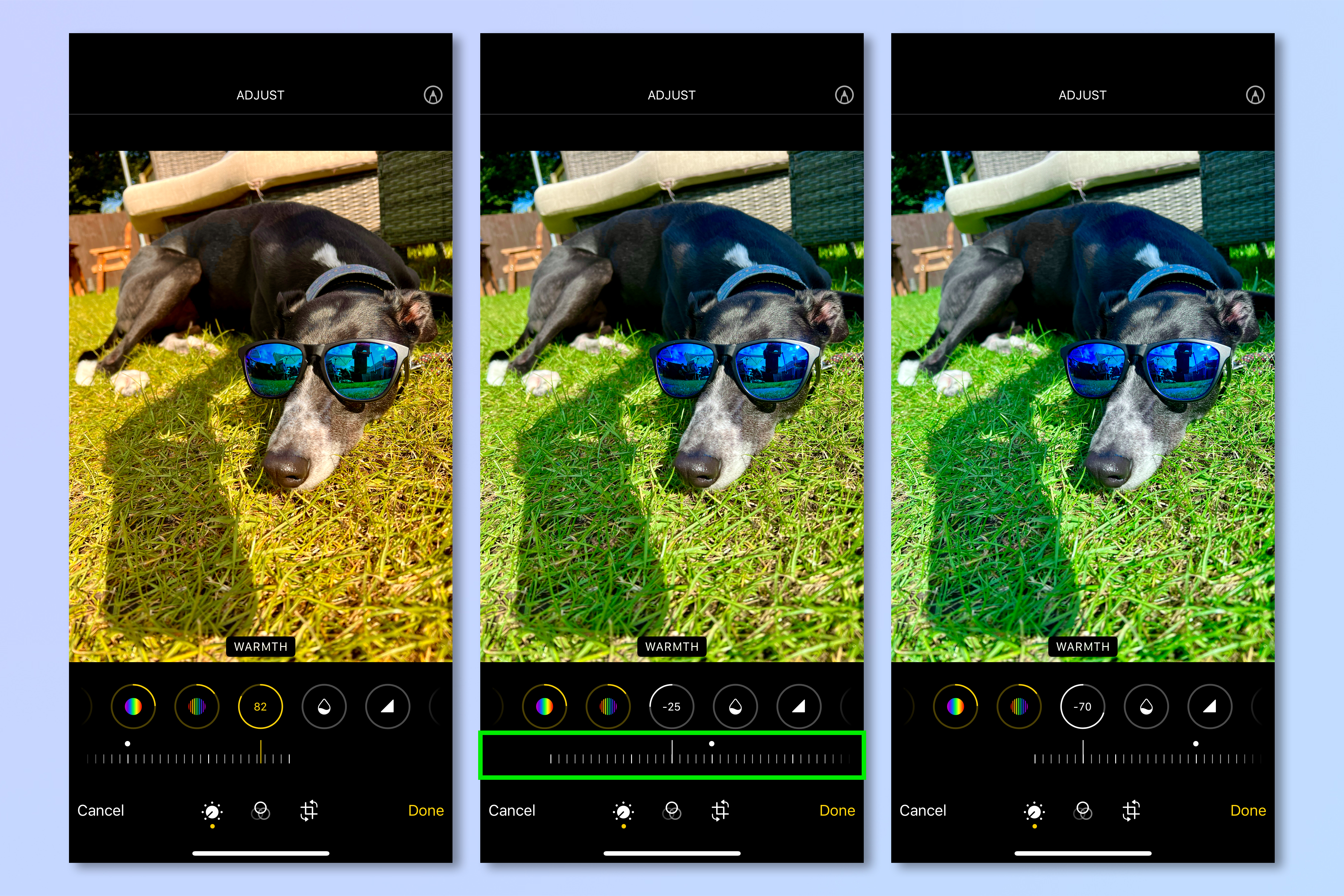
Adjusting your image: Warmth
By adding warmth, you give your image a warmer feel, hueing the image yellow. By removing warmth, you instead give the image a colder feeling with blue hue. Pull the Warmth slider to the left to add a yellow hue, and to the right to add a blue hue. These adjustments are usually used sparingly to avoid an overly yellow (left image) or blue image (right image). Once again, remember editing images is all about personal preference, so do what you think looks good.
Adjusting your image: Tint
Similar to the Warmth slider, the Tint slider tints the image either red or green. You can apply tints to change the appearance of skin tones, for example, if someone has a red tint which looks unnatural in your image, you could tint the image green slightly to counteract this. You can also use tints to boost similar colors. Tinting green, for instance, will increase the saturation of any green colors in the image. The downside is that tints are applied across the image, so you should only tint sparingly unless you want everything to look green or red. Pull the Tint slider to the left to apply a red tint, and to the right to apply a green tint. Again, extremes are often avoided, but just aim to apply a tint you think looks cool.

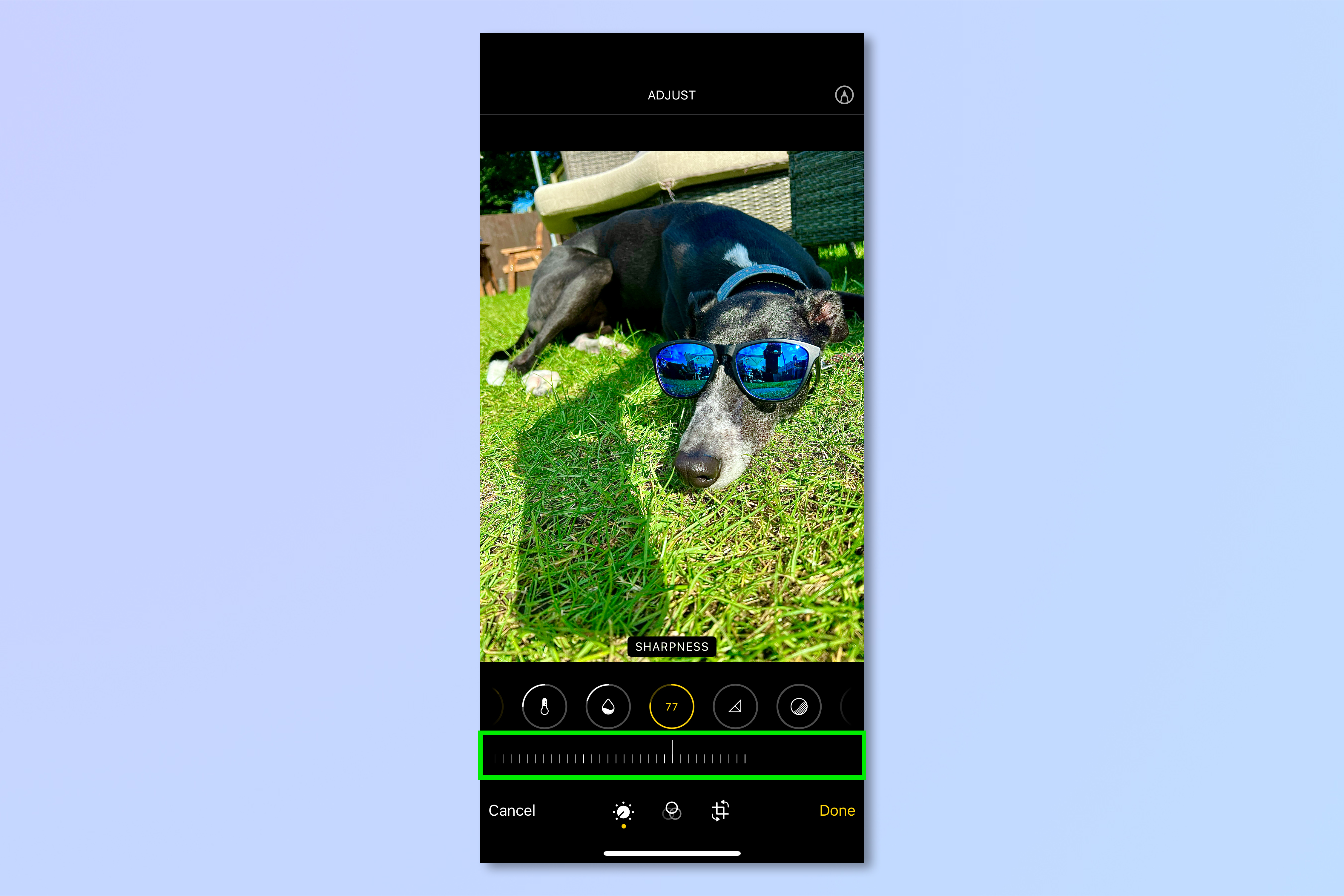
Adjusting your image: Sharpness
Adding sharpness gives the impression of an image looking sharper by increasing contrast, adjusting dark and light tones to accentuate the appearance of textures and edges in your photo. Sharpness will be at 0 by default. Pull the Sharpness slider to the left to add sharpness. As this tool uses contrast, applying a lot can make an image seem unnatural, so keep it light.
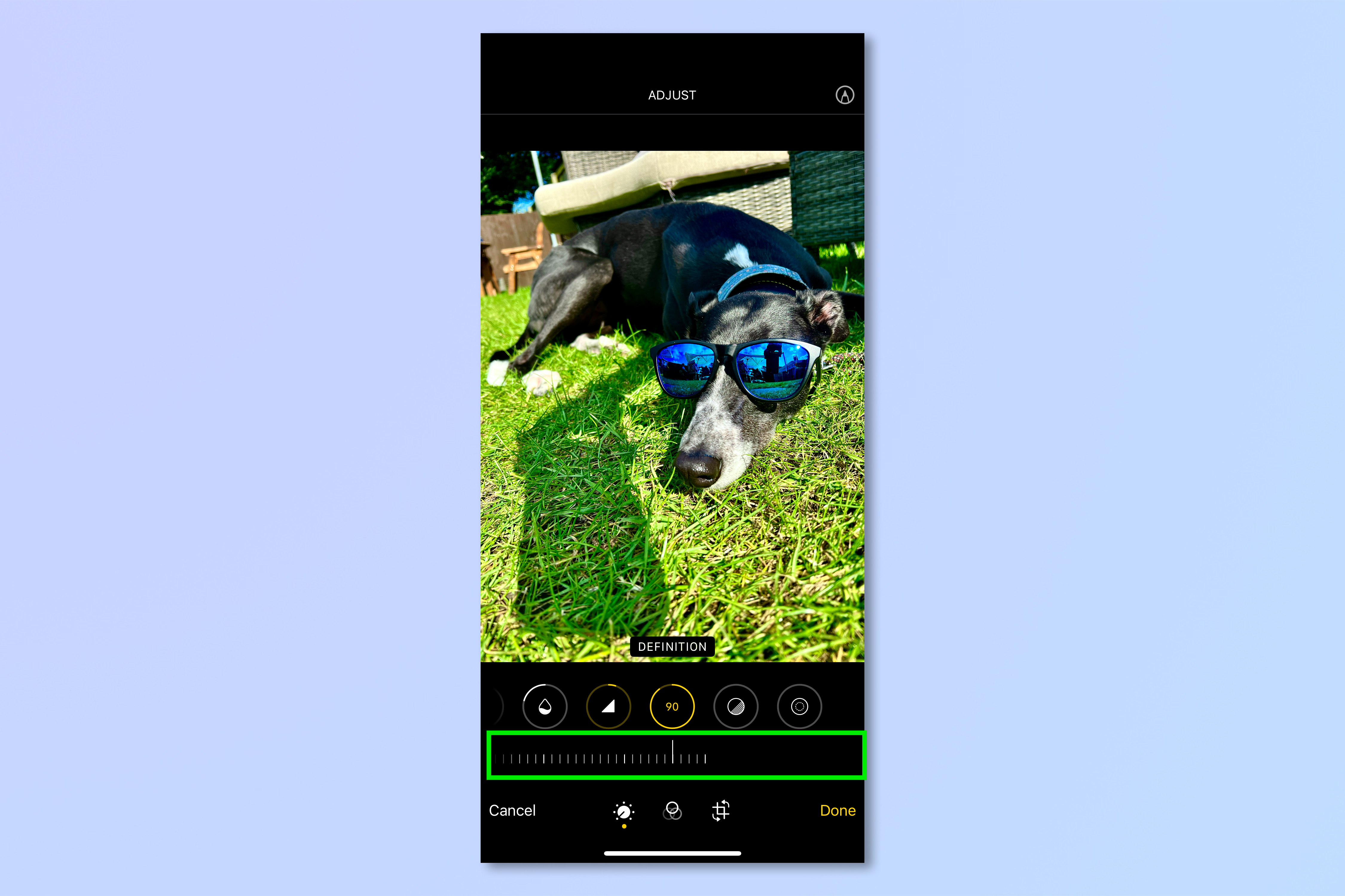
Adjusting your image: Definition
Definition adds clarity to a photo, making shapes and contours in the image look more defined by increasing contract and saturation. Definition will also be set at 0 by default. Pull the Definition slider to the left to add definition. Again, as this tool uses contrast, it’s better to add a little definition rather than a lot to avoid an artificial-looking image.
Adjusting your image: Noise Reduction
When you take an image in low light, your iPhone’s camera sensor will increase its sensitivity to pick up as much light as possible. This results in image noise, which looks like a grain across your picture. The Noise Reduction tool will smooth and reduce the appearance of noise, resulting in a cleaner image. Go too far, though, and your image will just look blurry. Noise Reduction will be set at 0 by default. Pull the slider to the left to reduce image noise.

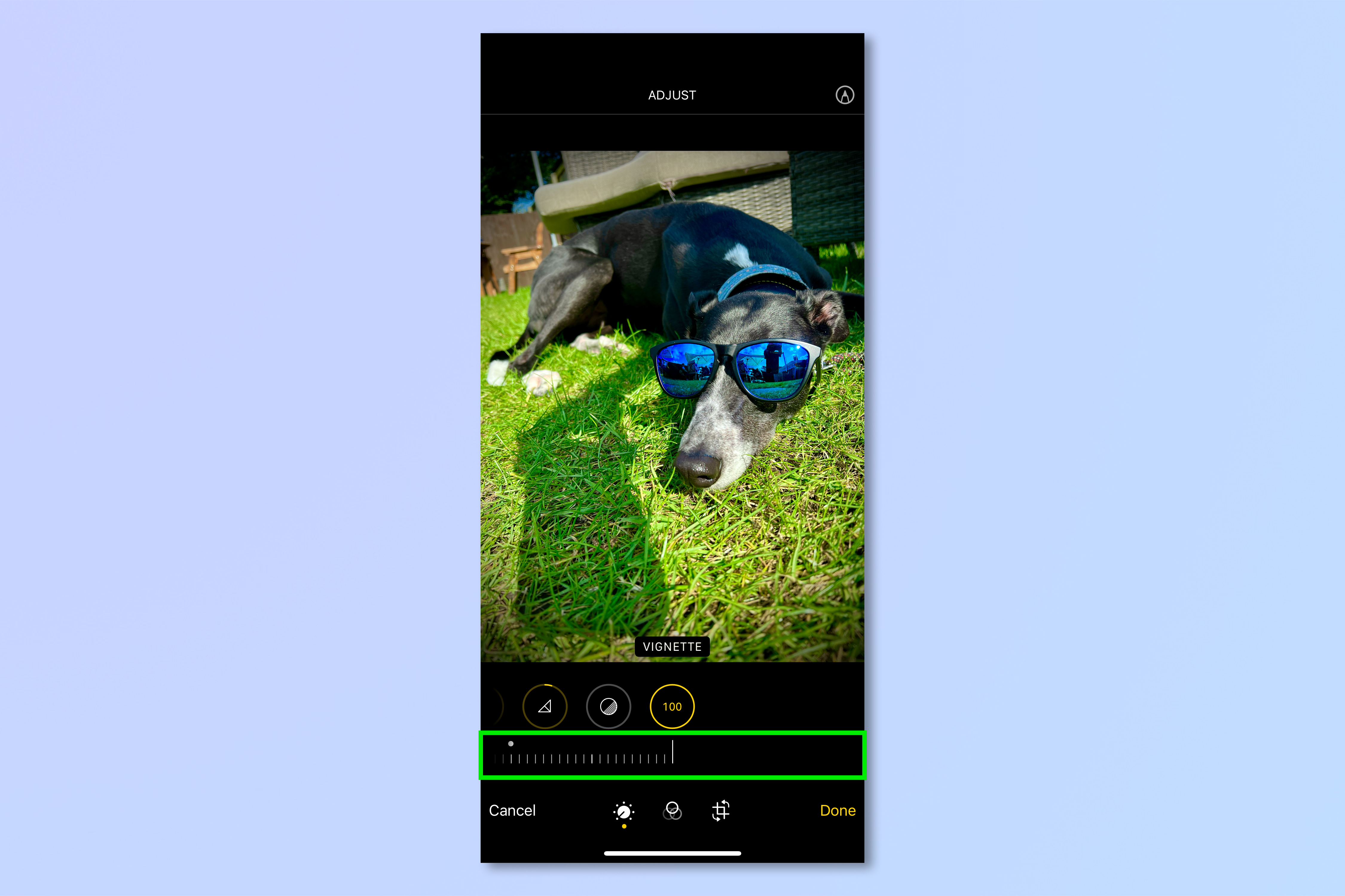
Adjusting your image: Vignette
The Vignette slider darkens or lightens the corners of your image. Some lenses apply vignettes due to their design, and you can apply a white vignette to counteract this in an image (not really a problem with iPhone camera lenses). You can apply a dark vignette to darken the corners of your image and draw attention to the middle. Apply too much, though, and your image will look like it’s from the 19th Century. Pull the Vignette slider to the left to apply a dark vignette, and to the right to apply a white vignette.
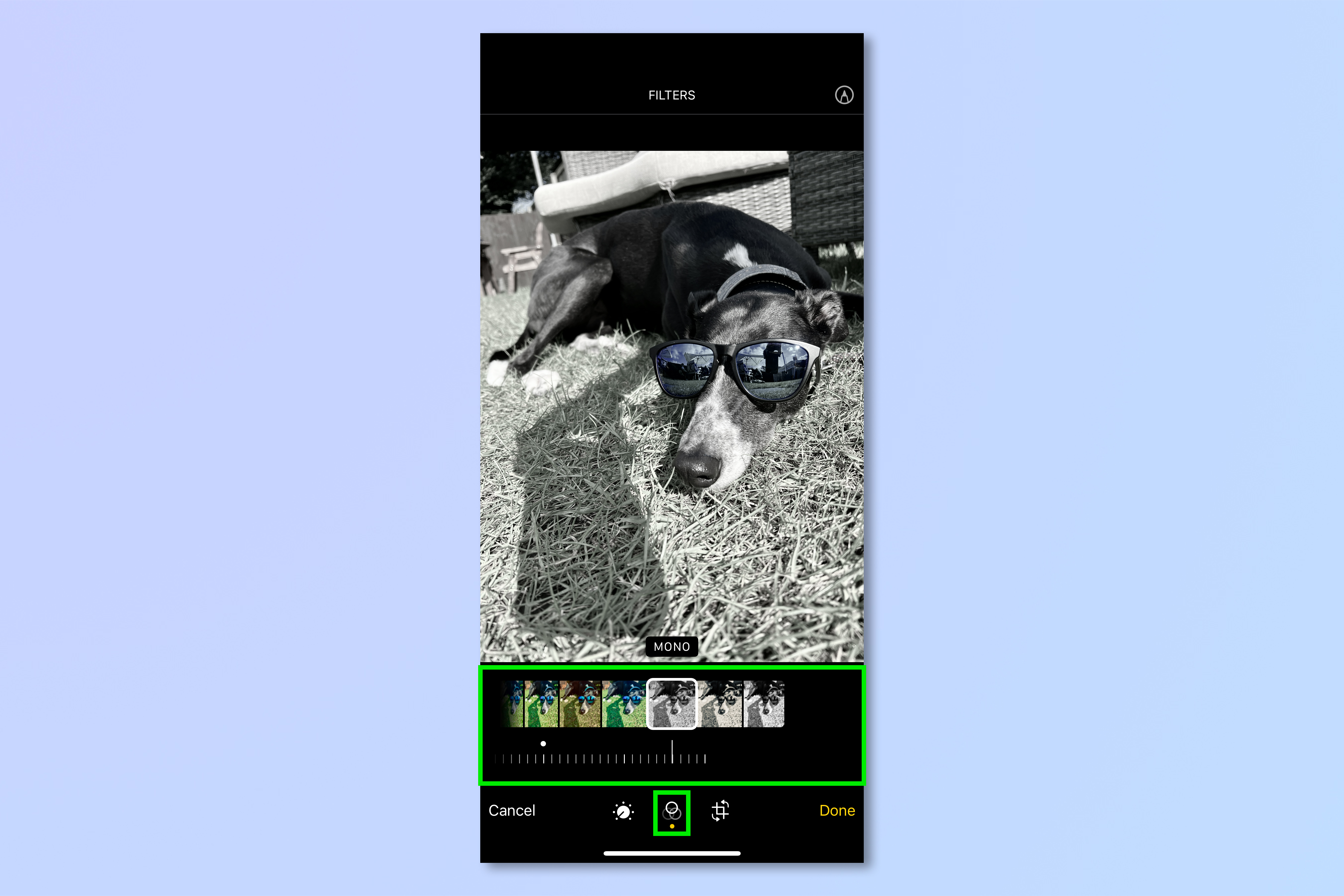
Using the Filters panel
1. To apply a filter to your image, select the Filters menu along the bottom of the screen.
2. Swipe through the different filters and choose the one you like the most.
3. Adjust the intensity of the filter using the slider below the filter tiles. Pull the slider to the left to increase its intensity and to the right to decrease its intensity.
Using the transform panel
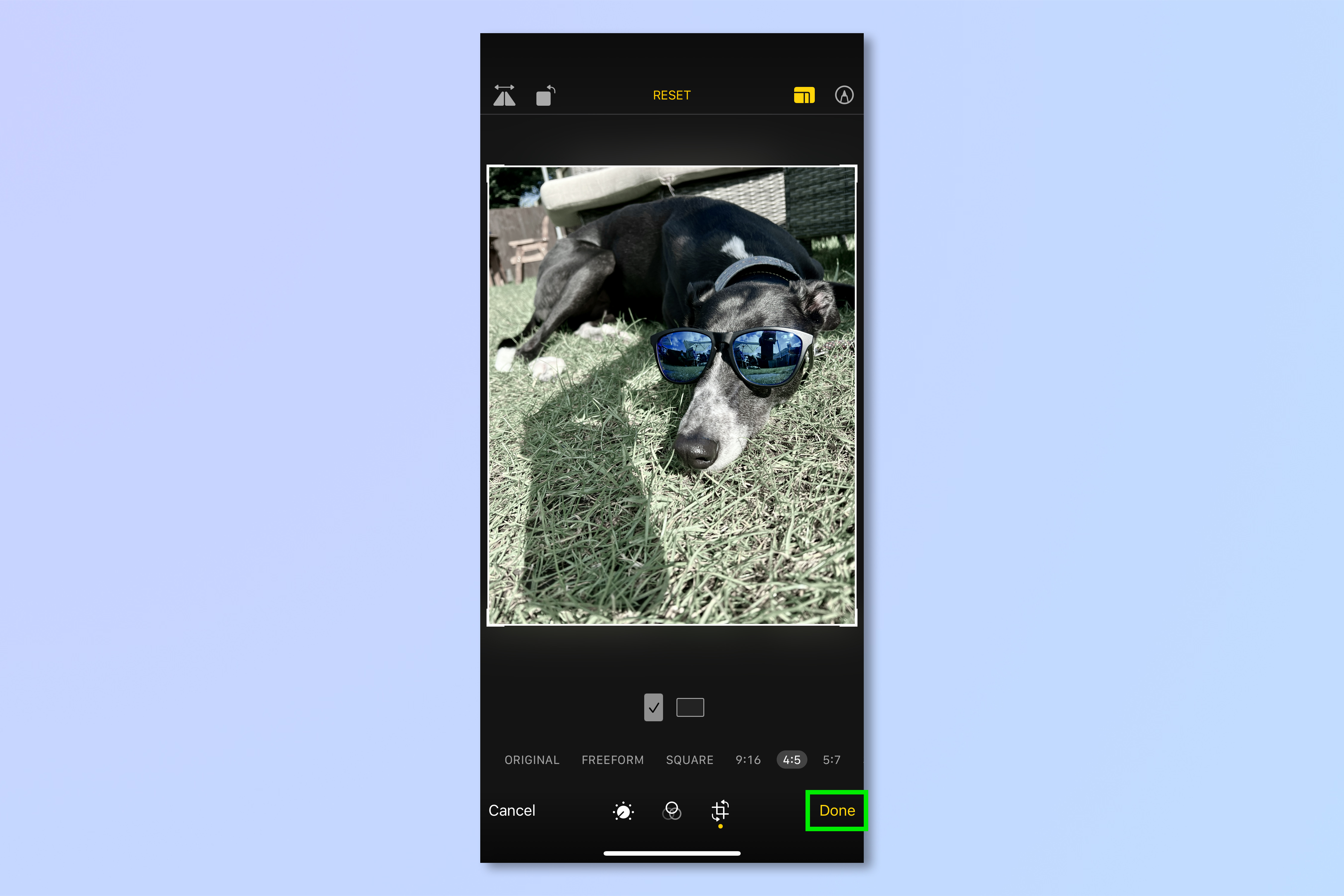
1. To make transformations to your image, go to the transform menu at the bottom by tapping the crop symbol.
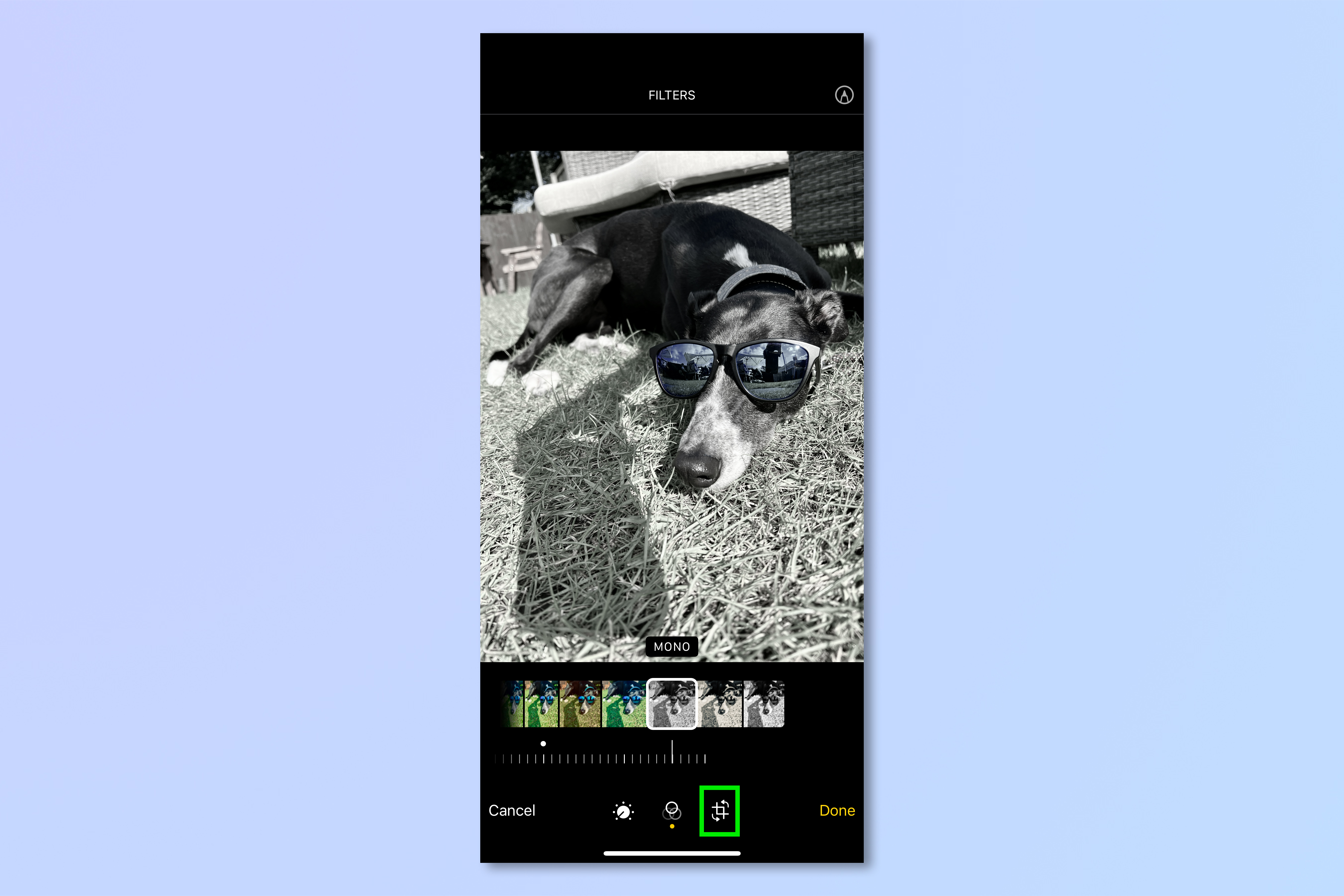
2. With the circular icon selected, pull the slider to rotate the image clockwise or counter-clockwise.
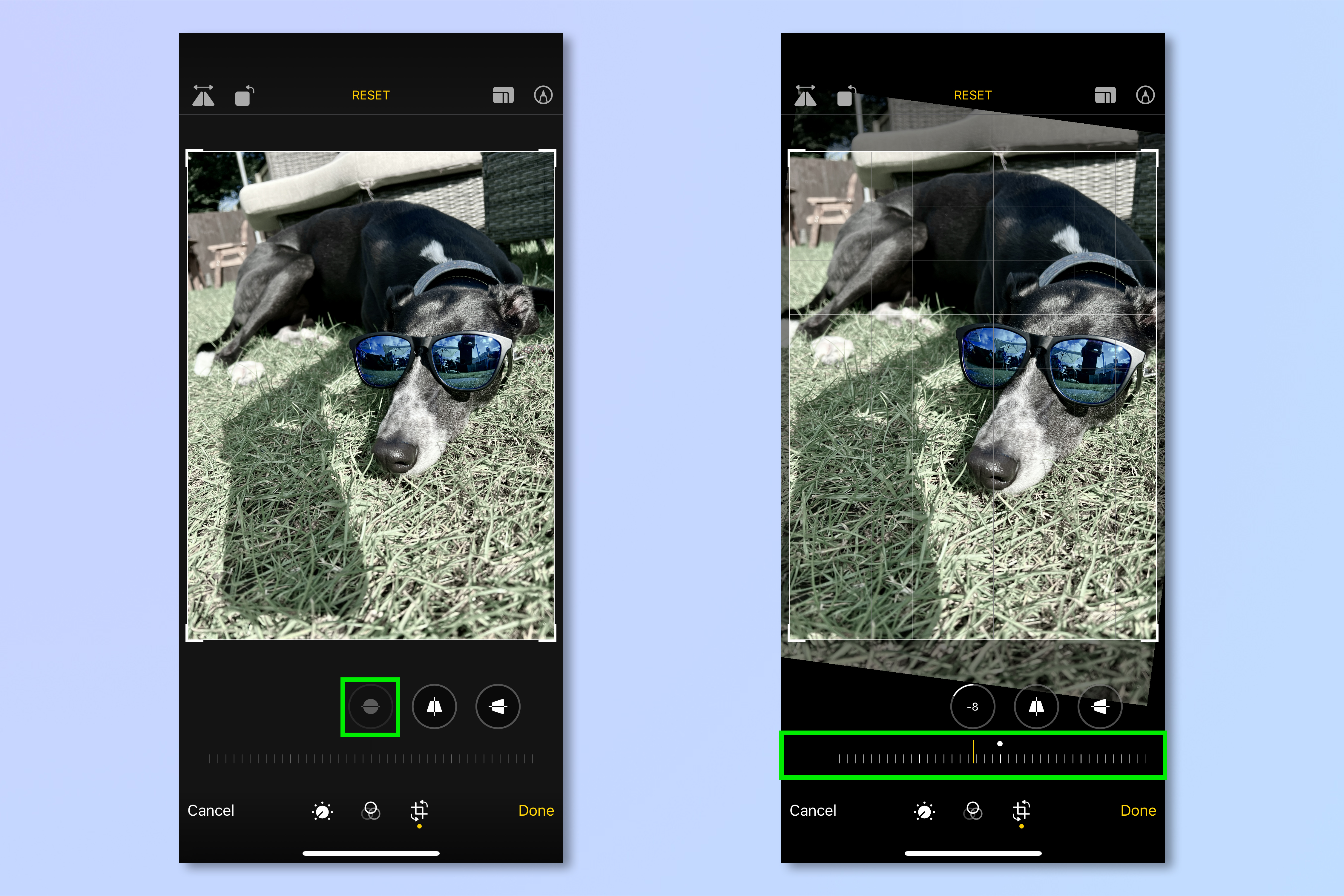
3. Select the upright trapezoid icon and pull the slider to adjust the image perspective vertically.
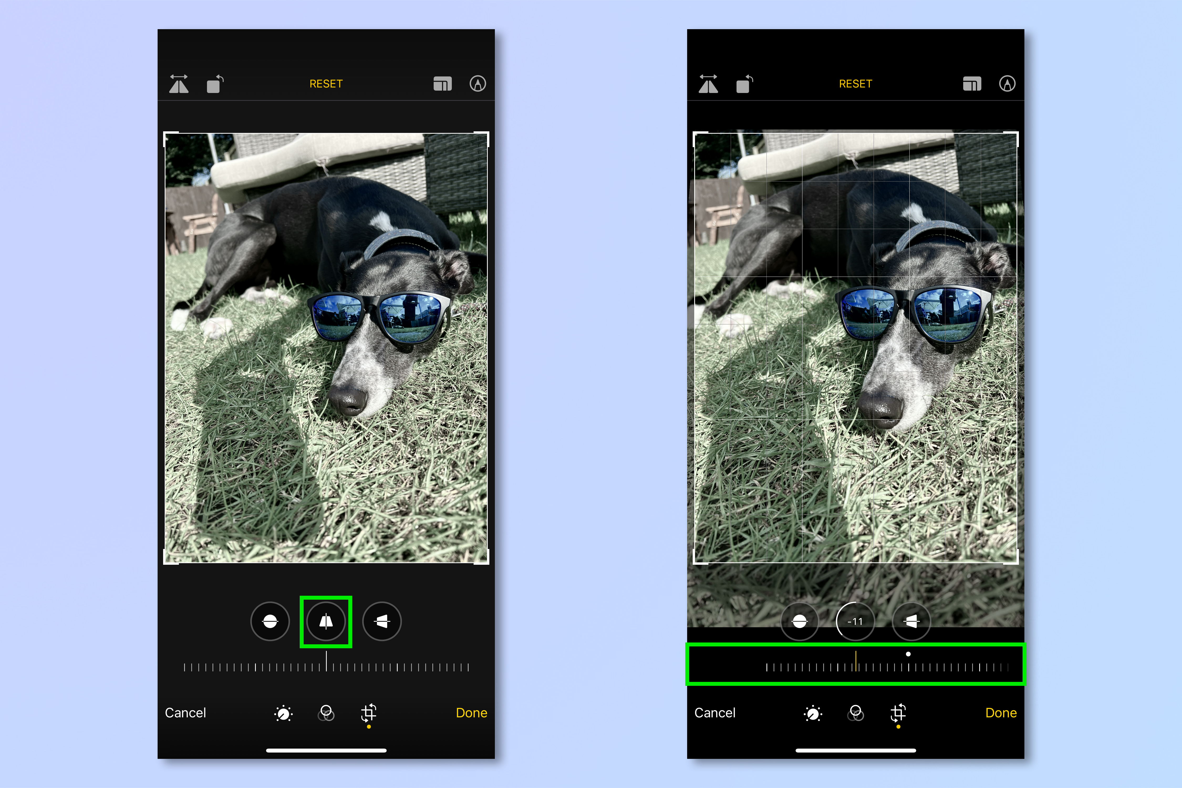
4. Select the sideways trapezoid icon and pull the slider to adjust the image perspective horizontally.
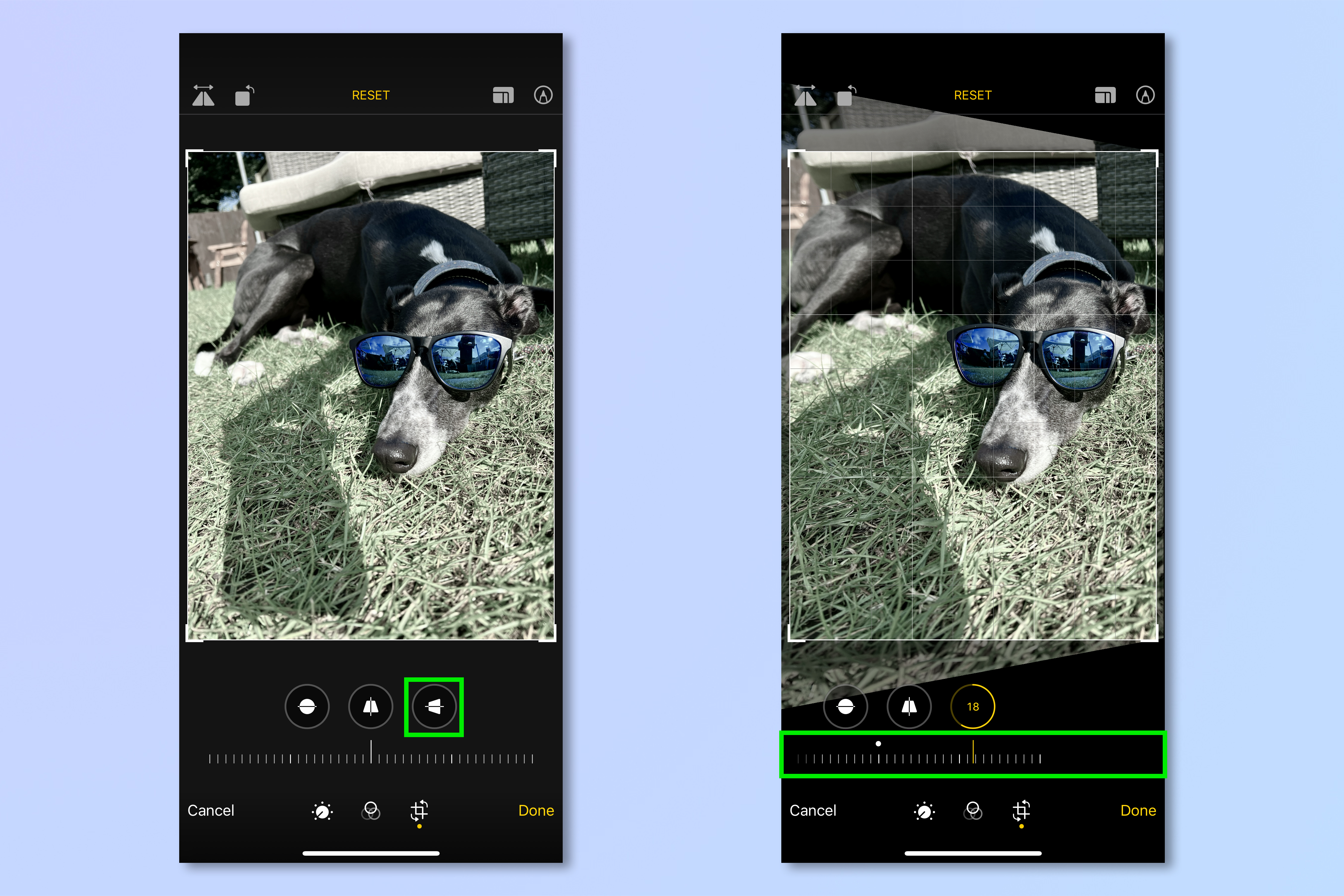
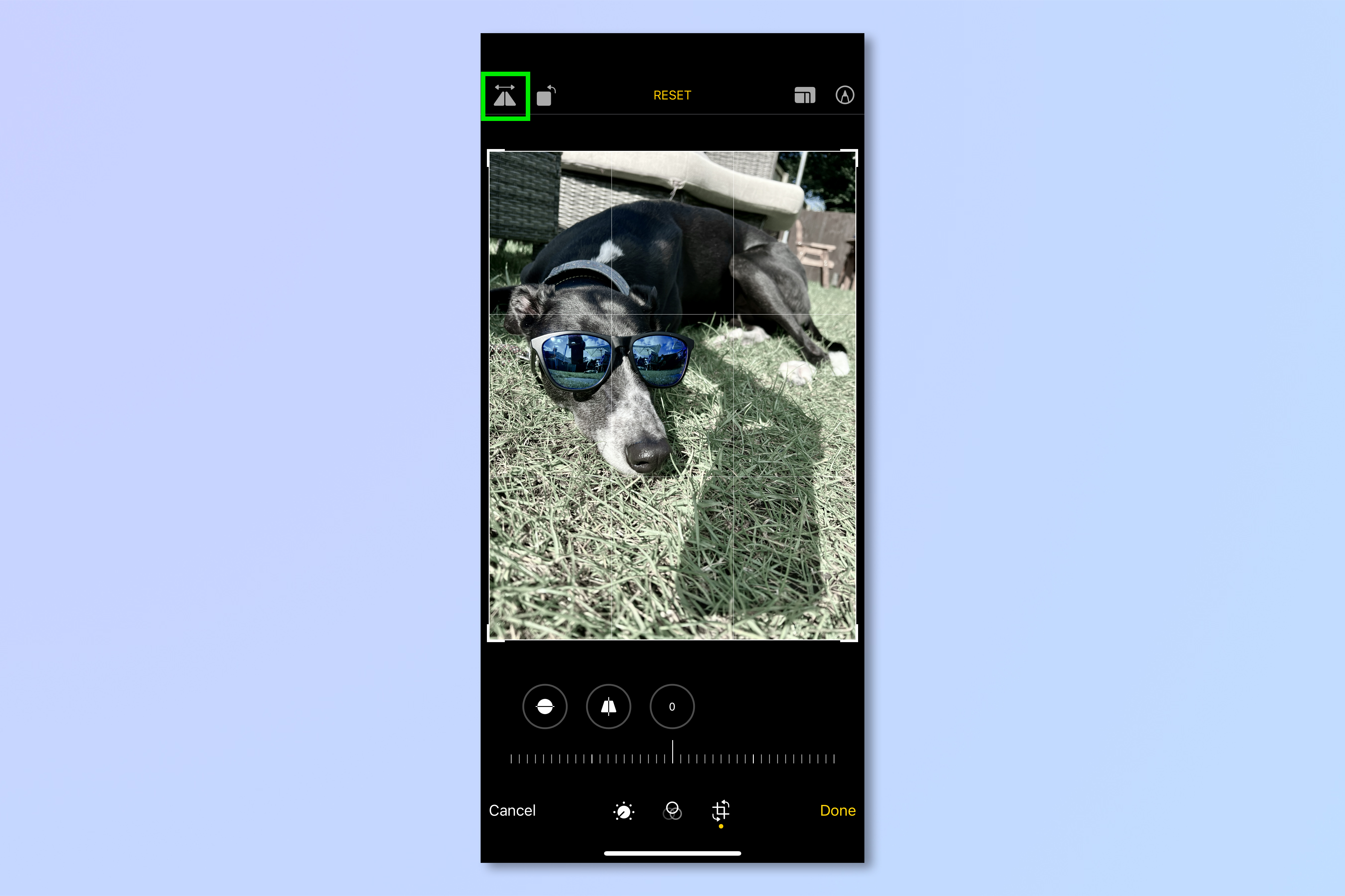
5. Tap the triangular icon, top left, to flip the image vertically.
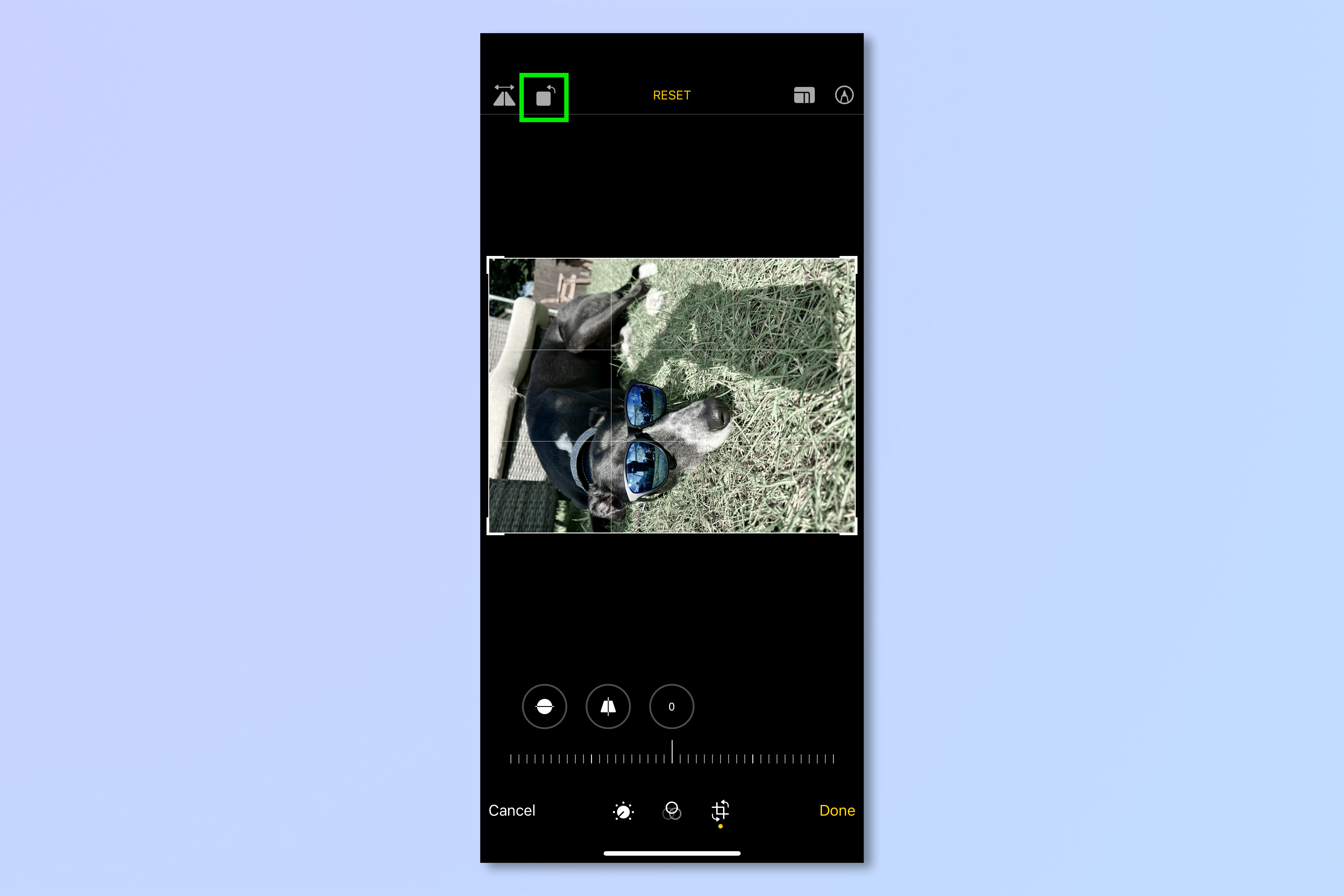
6. Tap the square icon, top left, to rotate the image 90 degrees.
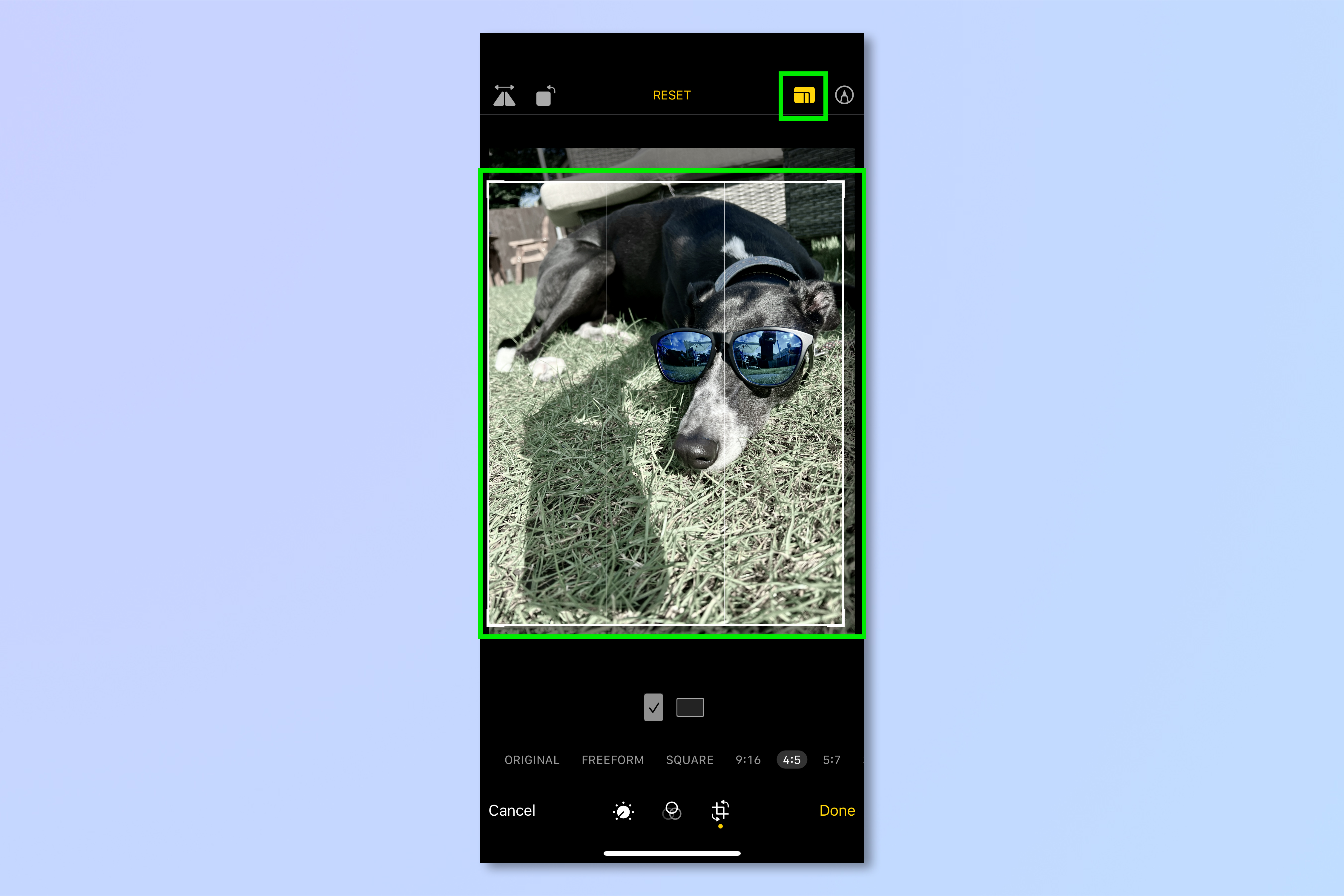
7. Tap the crop template icon, top right, to choose a pre-set crop ratio for your image, or crop in freeform. Drag the crop box to obtain the crop you want.
When you’ve finished your edits, however many or few you decide to do, tap Done in the bottom left, and you’ve successfully edited an photo on iPhone.
Now that you know how to edit photos on iPhone, why not check out our other Apple-themed guides, including how to switch Apple ID on iPhone and iPad, how to change your Apple ID and how to set custom battery alerts on iPhone.
For all the latest Technology News Click Here
For the latest news and updates, follow us on Google News.
