iOS 17 public beta is out — here are the 5 features you should try first
With the iOS 17 public beta now out, you may be ready to dig in to Apple’s latest operating system update for the iPhone. But which of the many iOS 17 features should you try first once your phone is running the beta?
It’s a trickier question than usual, since so many of iOS 17’s marquee enhancements like NameDrop for passing on contact posters and all the FaceTime changes require another person that’s installed the iOS 17 beta on their phone. That’s going to happen eventually — it’s a long time between now and the official release of iOS 17 in the fall — but maybe it’s not something you’re going to be able to do right away. Even Live Voicemail requires another person to call you up before you can see Apple’s live call transcription capabilities in action.
Not to worry. As I learned during my iOS 17 beta hands-on time, there are plenty of features you can explore on your own while you wait for others to grab the iOS 17 beta. Once you’ve installed the iOS 17 public beta, here are the five features I suggest you check out right away.
Messages
If you’re anything like the average iPhone user, you already spend a lot of time in Messages, so you might as well familiarize yourself with what’s new right away. And the answer to that is plenty — I count at least eight iOS 17 Messages changes that you’ll going to want to take out for a spin.
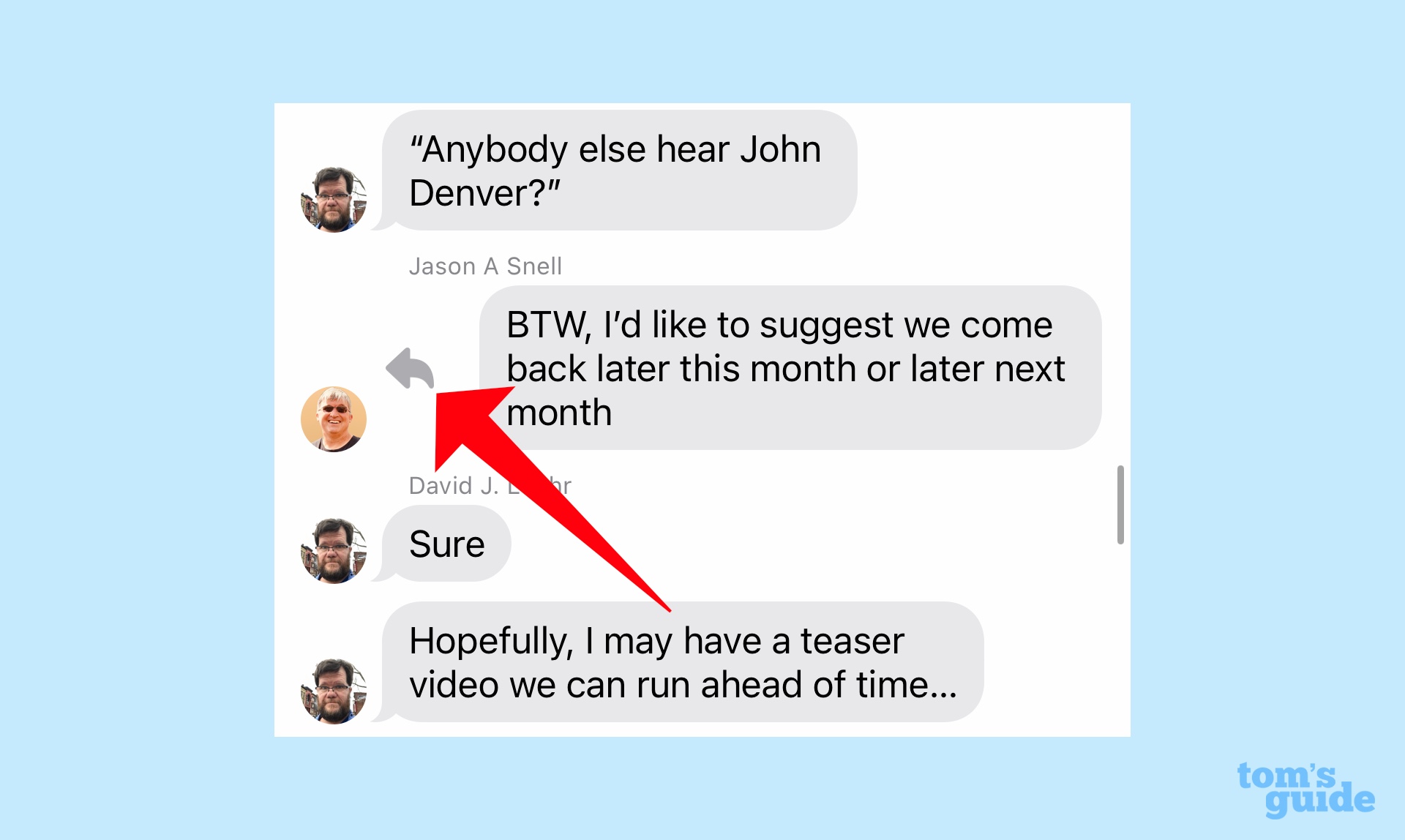
Some of these are fairly minor — a catch-up arrow now appears in the top-right of conversations and if there’s been a flurry of texts since you last checked in, you can tap that arrow to jump to the last unread message. Other Messages changes are very practical — you can now swipe right on a message to reply to it instead of tapping and holding and waiting for a pop-up menu to appear.
The biggest change you’ll want to explore is a move Apple made to reduce some of the clutter from the Message interface. Previously, your iMessage apps appeared in horizontally scrolling list right above the keyboard. That’s gone in iOS 17. Instead, there’s now a plus button to the left of the text field. Tap that if you want to find your iMessage apps.
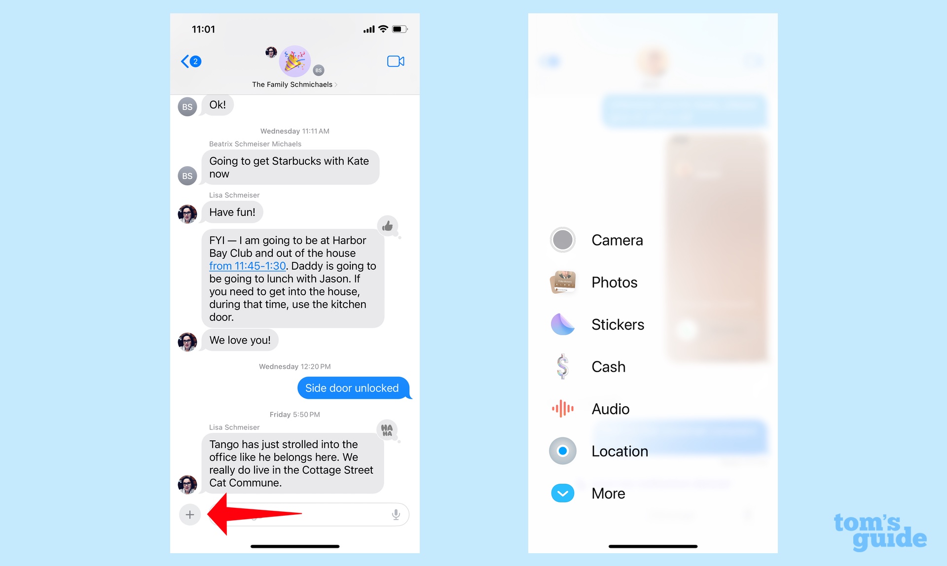
The most frequently used apps appear on the initial screen, and an upward swipe lets you scroll through the rest. Presumably, as you use particular iMessage apps, they’ll float to the top of the list.
I think the new look adds some more breathing room to Messages, but I understand that not everyone’s please about having to search for the apps they want to access. My advice is to start using the feature right away so you can get used to Apple’s new way of organizing things.
There are even more changes in Messages, most notably a Check In feature that lets you share location data in a text. But like the FaceTime and AirDrop changes mentioned above, you’re going to need other people running iOS 17 to test those capabilities.
Live Stickers
While you’re in Messages, check out the new Sticker drawer by hitting that plus button and selecting Stickers from the ensuing menu. There you’ll find a bin that stores all the stickers you’ve collected and created.
I can take or leave stickers personally, but there’s a pretty cool addition in iOS 17 you should check out right away — Live Stickers. You can take Live Photos from your photo library and turn them into a sticker, preserving the movement from that Live Photo.
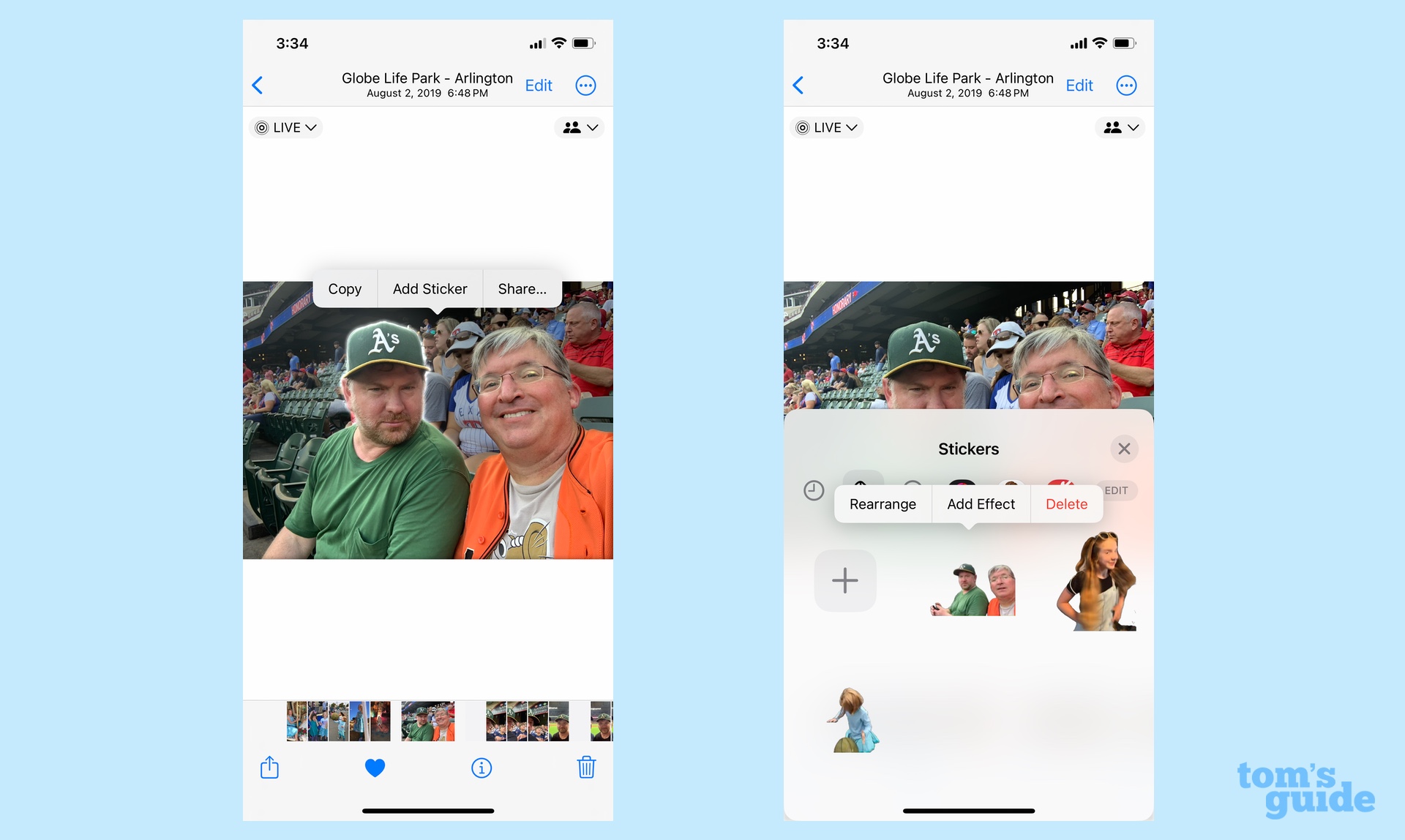
The feature taps into Visual Look Up’s ability to lift photos out of their backdrop and paste them elsewhere. In this case, you’re pasting them into the Sticker drawer. Simply find a Live Photo, then tap and hold on the subject you wish to copy. A pop-up menu will appear with Add Sticker as an option. Select that, and the sticker automatically gets added to the drawer, movement included.
StandBy
StandBy is clearly one of the most noteworthy changes introduced by iOS 17. When you position your phone horizontally and charge it, your iPhone effectively becomes a smart screen. It displays the date and time by default, but you can configure it to show widgets that display things like the temperature and upcoming appointments or have it cycle through some of your favorite photos. You can even use Siri in StandBy mode to control playback of music and shows.
StandBy mode works whether you use wireless or wired charging, but it’s probably at its best when your phone is attached to a MagSafe-friendly stand. I’ve plugged my iPhone 12 into a wall charger and propped up it horizontally to get StandBy mode to kick on, but that’s a pretty tricky task — it’s better to just use a charging stand instead to make the most of the feature.
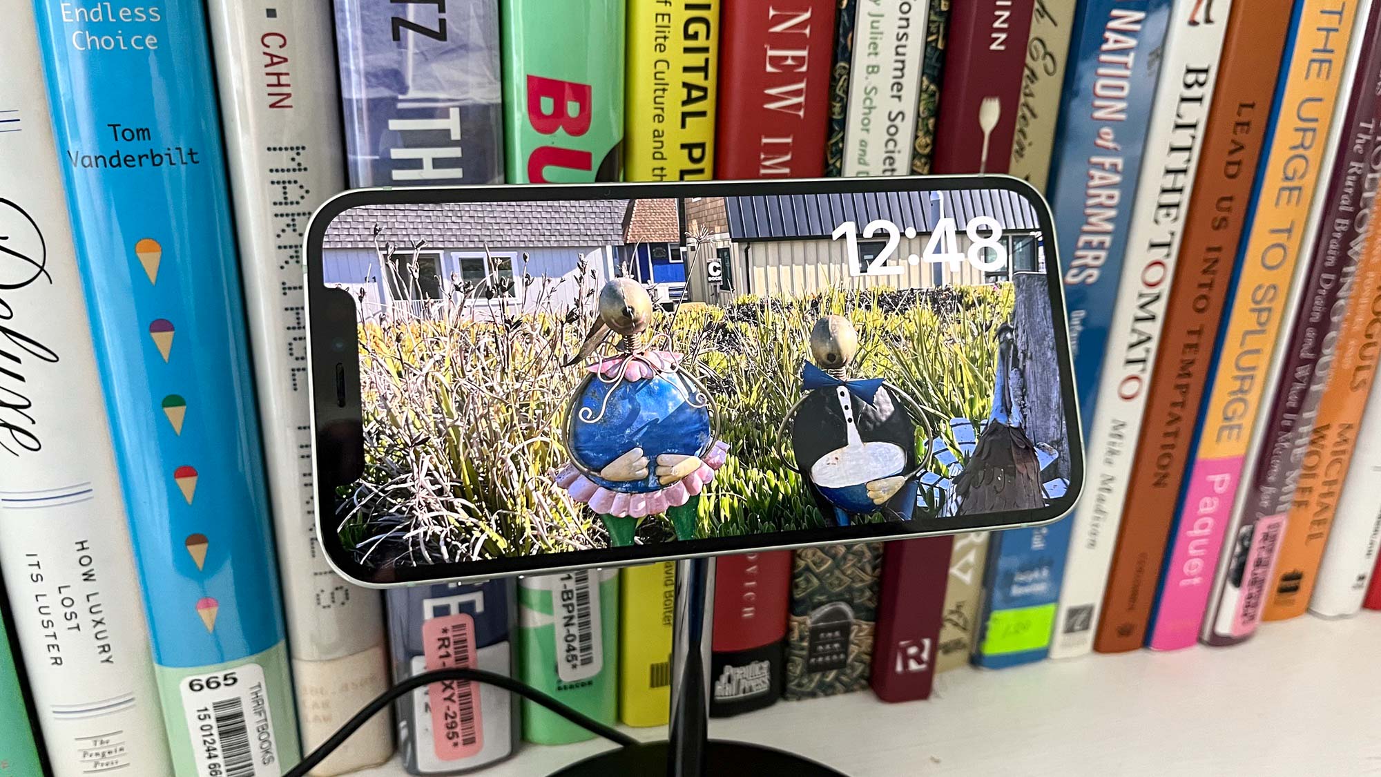
When you’re in StandBy mode, swipe left to try out the different screens, moving from a screen made up of different widgets to a photo display to one dominated entirely by a clock. On the clock page alone, there are five different clockface options that you view with up and down swipes. Several of those clockfaces give you the option to adjust the gradient color to your liking. Just press and hold on the clockface to configure it.
That’s also how you select which widgets you want to include — press and hold on a widget and then scroll through your choices. (You may be prompted to enter a passcode to unlock the phone to make changes.) Available widgets include ones from just about any of the iPhone’s built-in apps.
Apple says that StandBy learns your preferences when you use MagSafe to charge your iPhone, meaning that it remembers whether you want the clock, widget or photos view based on where your charging the phone. In my experience, this takes a little time for StandBy to pick up on, so there’s an advantage to using this feature early and often.
I’ve also learned that StandBy mode works best on a phone with an always-on display feature — basically the iPhone 14 Pro and iPhone 14 Pro Max at this point. On my iPhone 12, StandBy mode goes to sleep after about 20 seconds, which is a bit of a disappointment when I’ve got the screen set to show off photos and it dims before we’ve even cycled through one shot.
Reminders
Outside of Live Stickers, the coolest trick I’ve come across in iOS 17 involves Reminders, a decidedly not very cool app. If you use Reminders to create a grocery list, the app will automatically sort the items on your list by category.
Here’s how it works. Select Add List from the bottom of the Reminders screen and under List Type, select Groceries rather than Standard. As you add items to the list, Reminders will automatically sort them — sugar will go under Baking Items, red peppers under Produce and canned tomatoes under Canned Foods & Staples. It’s pretty magical, not to mention time-saving.
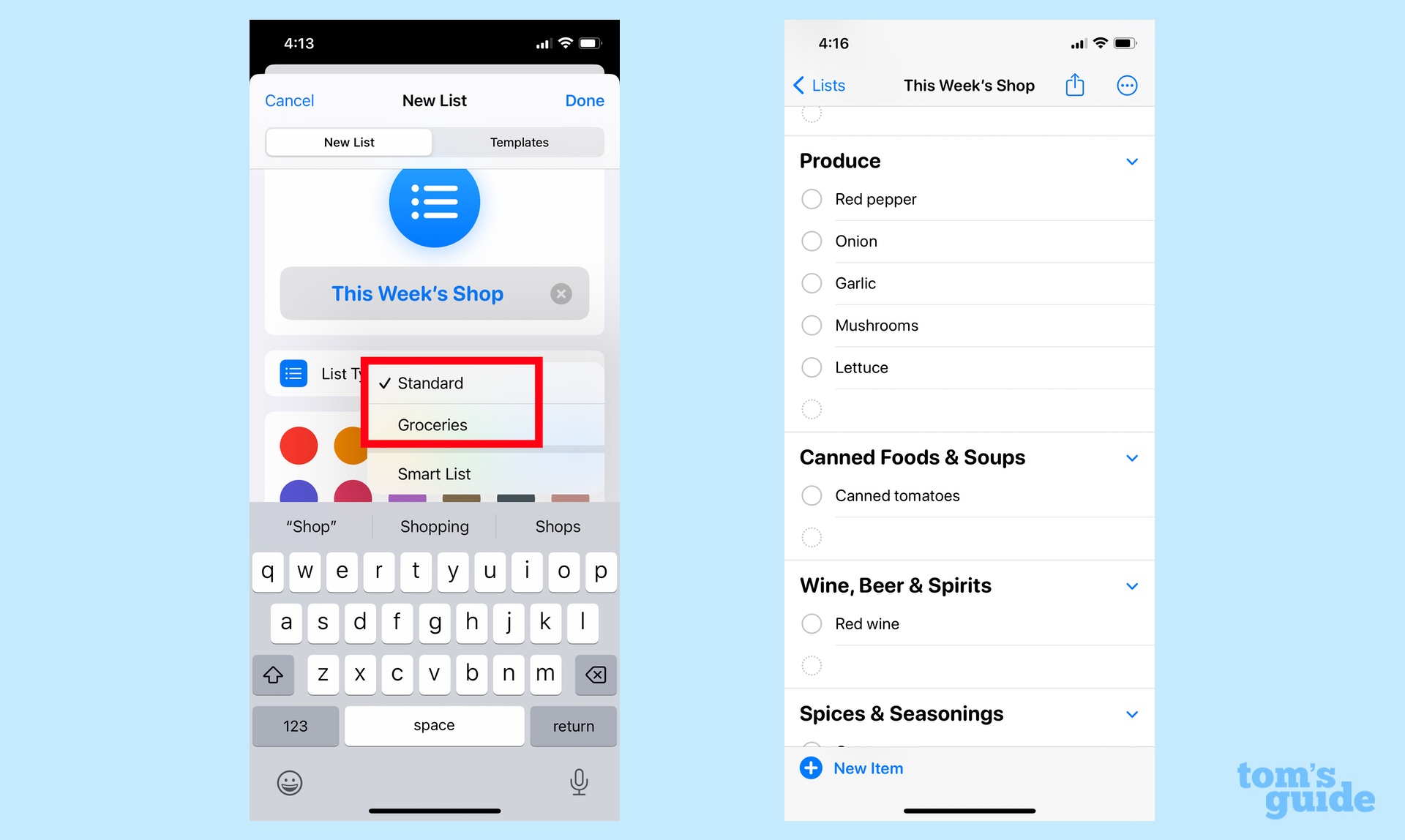
Reminders doesn’t get everything right. I typed “Parmesan,”” and it didn’t sort that under Dairy, Eggs & Plant Proteins. Adding “cheese” probably would’ve helped, or I could just manual move the item to the right area.
Anyhow, I recommend you give this new Reminders trick a try on your next trip to the grocery store.
Health
I think the new mental health features in iOS 17’s Health app are worth checking out if for no other reason than for you to personally see the value of what Apple’s added here. I felt as if there was some online eye-rolling going on right after the WWDC 2023 keynote in which Apple demonstrated how the Health app now lets you log your mood using a slider.
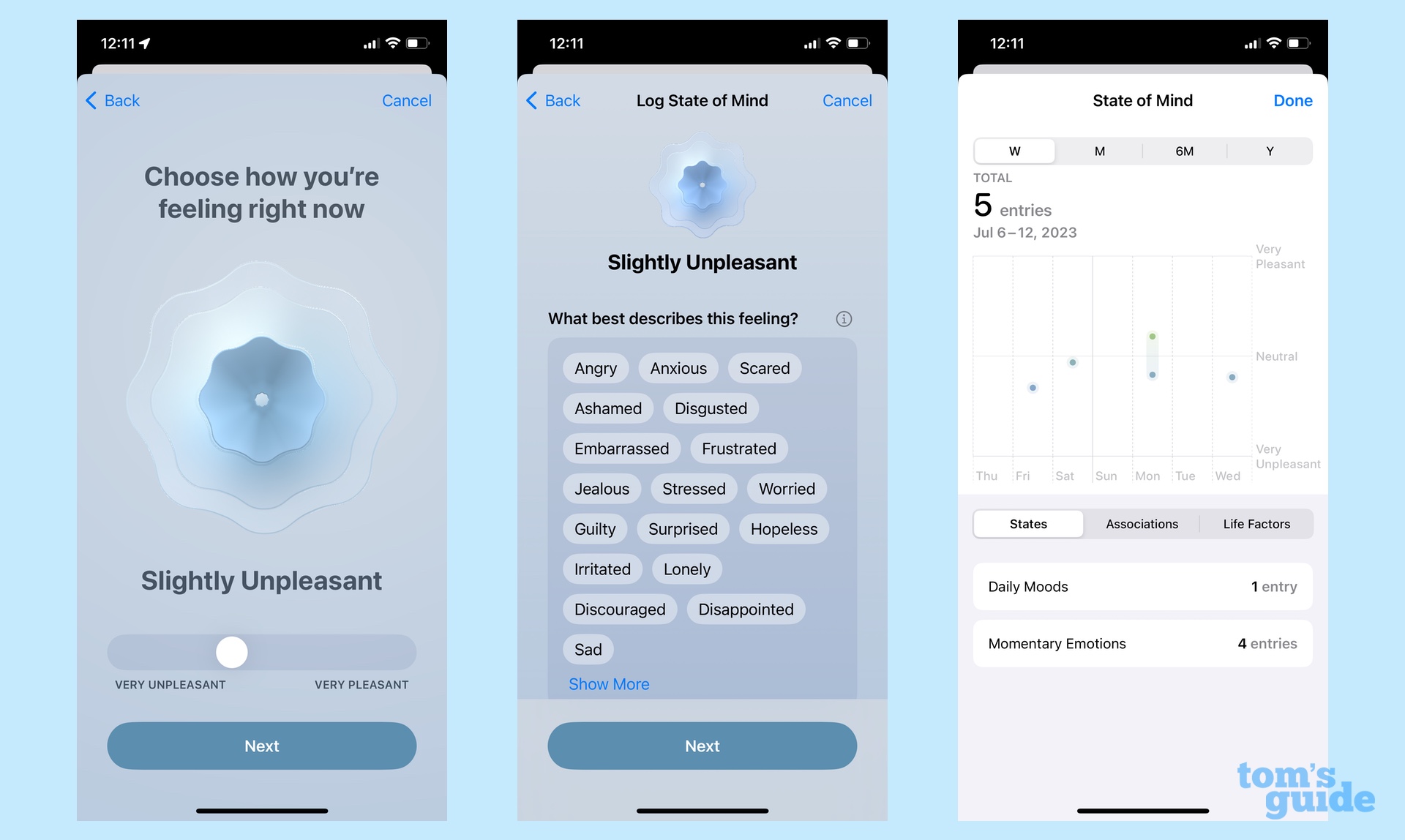
It sounds touch-feely and that impression is probably not helped by the flower-like graphic that shifts colors to reflect your mood. But there’s a lot of value here. You’re not just logging how you’re feeling but the things that are causing those feelings. Spread out over time, that information can show you what’s affecting your moods and when, giving you fodder for seeking out help or reflecting on ways to improve your mental health.
It may not be to everyone’s liking, but I think Health’s new mood tracking feature could ultimately prove to be the most valuable iOS 17 addition for a lot of people.
More from Tom’s Guide
For all the latest Technology News Click Here
For the latest news and updates, follow us on Google News.
